Author: Dan

  • 2010 Eagles UniDictions (uniform + predictions) – Week 2 – Lions

      Overview

    A lot of stories coming out of last week’s season opener against the Packers.  Injuries, a quarterback conundrum (don’t call it a controversy!), and what turned out to be a pretty good uniform match-up.  The 1960 throwbacks, which I publicly gave a “meh” opinion, actually worked quite well on the field.  And oh yeah…my first UniDiction: Packers 26, Eagles 18.  Actual score: Packers 27, Eagles 20.  I’m going to count this as a win for my “system.”

    The Lions have only worn white at home twice in their (documented?) history, so it’s safe to assume they’ll be wearing their Blue over Silver uniform, not White over Silver, which puts the Eagles in the White over Midnight Green combination.  Wikipedia says  The Lions  have a throwback uniform in their repertoire, but looking through pictures of each game last season, they haven’t been worn since the  the 2009 uniform/logo update, and let’s be honest, if they’re worn this year, they’ll save them for the Packers or Bears.

    There are no “uniform stories” this week (do brain injuries count as “uniform stories” because a helmet is involved?  hmm…no.  no they do not), so let’s get right to the for the full breakdown after the jump.

    The UniDiction

    Either 2, 3, 6, or 7 points awarded for each category (safety, field goal, touchdown, touchdown+point after, of course)

    Helmet

    Eagles: 7 — Metallic Midnight Green, Nicely detailed wings with the silver pattern, black then white double-stroke really makes the design pop.  The helmet is definitely the strongest visual identifier for the Eagles.

    Lions: 2 — The Lions’ logo is, and has always been “blah,” even though the 2009 refresh specifically tried to address this.  Unfortunately, I’m not a fan of the Lions’ color scheme, so nicely proportioned stripes aside, the Silver+Blue+Black+White aren’t making up for the dullness of the logo.

    Jersey

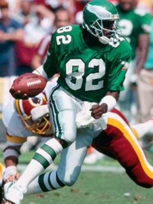
    Eagles: 6 — Finally some stripes after last week’s throwbacks!  The green jersey is the one in the Eagles fan’s mind’s eye, but there’s nothing wrong with the white one.  Check out this picture of Kevin Kolb from last week’s game.  Based on the fans, it would appear that the Black, Midnight Green, and Kelly Green jerseys are much more popular than the White jerseys.

    Lions: 2 — Supposedly the blue is officially called “Honolulu Blue.”  It can be bought as a real-deal paint color, so I guess it’s a real color.  (example: Kelly Green is a real color, Midnight Green was created by marketers).  But Honolulu Blue.  It’s like the Color Train was between the baby blue and Yale stations, so decided to choose neither.

    Pants + Socks

    Eagles: 6 — The stripes on the pants, at first glance, appear to be Black/White/Black, but there’s a neat detail hiding there.  The “back” stripe is actually dark grey, not black.  The solid black and white sanitaries and socks…plain, but they work without turning the whole combination into stripezilla.

    Eagles: 6 — Compared to the normal Green over White combination, these are just lacking…something.  BUT, the Eagles do have one of the best looks in the league, effectively mixing the traditional and the modern without looking like an over-financed high school team.

    Lions: 3 — I can’t ever fault a team for trying to honor tradition [within reason] (and generally succeeding – as Paul Lukas said last year, they still look like the Lions), but if ever a uniform is exactly the sum of its parts, it’s the Lions in “Honolulu Blue” over Silver.  Actually, their White over Silver isn’t so bad.  And…at least they’re not wearing the amateurish Black over Silver from the pre-2009 uniform set.

    Final Score

    Eagles 25

    Lions 13

    **

    This week’s match-up gets two stars; the Lions uniform is nothing special, and the game will likely be just as (non-) special, and the Eagles will be wearing their “B” uniform.

  • 2010 Eagles UniDictions (uniform + predictions) – Week 1 – Packers

    This has been cross-posted on crossingbroad.com, a great destination for Philadelphia sports news.

    Mainweek1

    Being that all predictions for the NFL season thus far are based on a combination of  last year’s results and four pre-season games (The NFL Pre-Season — The four weeks when your friends with season tickets slightly regret their purchase!), we might as well base our predictions on something more arbitrary with little bearing on the actual game*.  Uniforms. 

    [*I think some coach or player was once quoted as saying “look good, play good,” so creative interpretation of the rules of English grammar aside, I’ll leave it at “little bearing” instead of “no bearing.”] 

     The big news for this game is that the Eagles will be wearing their 1960 throwbacks.  As detailed at great length previously, I don’t like them.  Classic, accurate, but too plain.  The presence of Kelly Green should appease the loud “bring back the Cunningham-era jersey” people who don’t realize that the throwbacks are not the same as the “Cunningham-era” uniforms (white vs. silver paints, Eagle logo on shoulder, stroke around the numbers, helmet wing details, etc.).  So at the minimum, it takes away their ability to complain about the uniforms, giving more time to complain about things that matter.  Like Kevin Kolb.

    With the Eagles wearing green jerseys, this puts the Packers in their White Jersey/Yellow Pants combination.  I don’t think it’s the best combination in the NFL (undecided on that one at the moment), but it’s everything the Eagles throwback is….except it’s not boring.  Something as simple as shoulder striping really makes the look of the “classic” NFL uniform template work well (think of the Bears and the Browns).

    The UniDiction

    Either 2, 3, 6, or 7 points awarded for each category (safety, field goal, touchdown, touchdown+point after, of course)

    Helmet

    Eagles: 3 — a white (or black) stroke around the wings would really help.  Really, the design looks unfinished.  A plain green helmet, though historically inaccurate, would look better.

    Packers: 7 — there’s absolutely nothing I would change

    Jersey

    Eagles: 2 — Championship aside, this isn’t one of the Eagles’ better looks.  It’s just green with white numbers!

    Packers: 6 — missed PAT because their Green jersey + yellow pants combination is one of the defining images of the NFL.

    Pants + Socks

    Eagles: 6 — the two green stripes on the white pants definitely add something, and the white stripe on the green section of the socks avoids the “endless field of green” effect seen on the jerseys.  That said, one thick vertical stripe would look better on the pants.

    Packers: 7 — the contrast-color/white/contrast-color triple stripe on the pants is nice touch, and the two-tone socks (without anything breaking-up the solid color) work because they would look too busy with a stripe, being that there are plenty of stripes elsewhere.

     Intangibles

    Eagles: 7 — authenticity counts and the fan base really likes them.

    Packers: 6 — Points awarded for using yellow in their color scheme.  Missed PAT due to the management thinking a uniform from an era with completely different equipment would translate to the 21st century.

    Final Score

    Eagles 18

    Packers 26

    Hmm… I may need to adjust my scoring system to add up to numbers which look like real “football scores.”  And so it can go above 28… 

    Also of interest, UniWatch (Paul Lukas) on Page 2 posted his 2010 overview of all NFL uniform changes yesterday.  Definitely a must read.

    ****

    The match-up itself gets four stars. Both teams will be wearing “classic” uniforms, and both teams’ colors complement each other.

  • Eagles 2010 Uniform Round-Up – The 1960 Throwback

    This has been cross-posted on Crossing Broad, an up-and-coming Philadelphia Sports destination — heck, they’re the ones who broke the story that Dorney Park was the first rehab assignment for Ryan Howard

    Lil’ Shebaz: Patriot, Martyr, Wide Receiver.

    It’s that time of year – the notable roster additions and subtractions have been discussed, the expected win-loss record has been decided, the newly featured players have had a chance to step up, and the Cowboys fans have been thoroughly bashed.  What’s left?  Well, three interminable pre-season “games,” and lengthy discussions of uniforms.

    We’ll be taking a hard look at the Eagles 2010 uniform situation today, then running a week-by-week season preview showcasing each expected match-up.  (the NFL doesn’t have hard and fast “home” and “away” uniform designations like baseball, so there will be some guessing)

    The biggest uniform news this season by far is the addition of the 1960 Kelly Green over White Throwback to be worn for 2 (or 3?) games.  Though most fans (this one included) have generally positive opinions of the current “Midnight Green” uniform sets, others clamor for a return to the Kelly Green, which had been the primary color used from 1948 (or prior?) to 1995.  “They should wear the Cunningham-era jerseys again” was the typical comment, and I think that most people lump all of the Kelly Green designs together (they look almost the same from the beginning to the last ones in 1995), and, well, the Cunningham “era” is the most convenient point of reference for the “old school” look, if only because the Eagles weren’t a particularly great team during his 1987-1994 run, and the McNabb era is associated with the Midnight Green, though it predates him by three seasons.

    Of course, the “reason” (beyond additional merchandise revenue — yes, people even bought the yellow and blue monstrosities from 2007) for the throwbacks is to celebrate the 1960 season, so much of the discussion of “this other Kelly Green design would have been better” is rather moot, but words and opinions are free on the Internet, so here comes the soapbox.  Keep in mind this is not a discussion of the authenticity of the throwbacks or how close they got to the classic look; this is all about the look itself.

    Simply, the 1960 throwbacks are boring.  Not because they’re “old,” not because they’re “classically simple,” but because they’re brutally plain.  Look at what the Packers and 49ers can do with the “classic” NFL template.  I don’t need the modern busy-ness of the Bengals, the Bills, or the Broncos, but the jersey is literally just green with white front/back numbers and TV numbers (what numbers on the sleeves are called).  No stripes, no trim, no stroke around the numbers, heck no logo (the Reebok logo doesn’t count) or even Eagles wordmark.  Sure, they’re authentic, but they’re boring, too.  [I don’t think the current uniforms are perfect either; see my comments in future articles.]  Come to think of it, the vaunted “Cunningham-era” jerseys aren’t all that great either; very, very plain, but at least they added an Eagles logo to the sleeves and black stroke around the numbers (on both the green and white jerseys) adds something to it.

    The pants and socks are an improvement, with two green strips along the outseam of the white pants, a white belt, then a ~50/50 ratio of white sanitaries over green socks, with a slim white band on the green socks to visually “break” the verdant field.  (triple word score!).

    Unfortunately, in the interest of authenticity, the wing detail on the helmet is plain silver.  It lacks both the simple white stroke of the “Cunningham-era” helmets and the more complicated black and white inner and outer stroke of today’s helmets (which also include an arguably excessive silver highlight color to give more definition to the “feathers”).

    Ignoring the significance of the 50th anniversary, what were some other, maybe more visually interesting options?

    Well, the 2nd most of thought of (in my incredibly unscientific poll of one) Kelly Green uniforms are those funky ones from 1969-1973 with a white helmet with green wings.  (even funkier in 1973 when they had a black stroke around the green wing).  Then there are those “wasn’t disco bad enough” late 70s-early 80s disasters.  Or as I call them Stripezilla 1 and Stripezilla 2, Stripezilla’s Revenge.  Or, they could’ve done something practically sacrilegious and just replaced Midnight Green on the current uniforms with Kelly Green and swapped in the silver pants of the “Cunningham-era” (file by Jeff Shirley from a uniwatchblog.com uniform tweak round-up).

    Look for future articles about uniforms as the season approaches, then a weekly uniform-centric overview of each upcoming game.  Until then, enjoy the Eagles in their white over white combo, a look which is unique to their pre-season games.

    **½

    The 1960 Eagles Throwback gets two-and-a-half indecisive stars. It’s nice to see the Kelly Green on the field, but it’s definitely not the best version, even if executed exactly.

  • 2010 Academy Awards


    Alec and Steve were the only friends left at “Oscar’s” birthday party after mom kicked Kratos out after “the incident.”

    Some quick thoughts opinions:

    The “interpretive” dancing to accompany the Best Music (Original Score) nominees was tacky and plain-old ridiculous. Being that the music was written for a movie, why not show either a) a montage/custom trailer showcasing the music against the images or b) show a specific scene from the movie as-is which highlights the connection between composer and the visual material. The eventual winner, UP, has a sequence which would have lent itself perfectly for, you know, showing the effect of the music instead of a bunch of people spinning on their heads or doing the robot. If they want to show break-ish dancing, America’s Best Dance Crew does it better (and without the false pretense of it being “fine art.”)

    Aside from the fact that a movie which would be more properly described as “rendered” (or raytraced, or something or another) rather than “filmed,” won for Best Cinematography, why did they show no clips, again, showcasing the recognized, excellent cinematography? I believe only the title cards were shown. Sure, most of the movies (except, Harry Potter, I believe) were shown in other awards’ intro sections, but movies are a visual medium, show it if it’s awards-worthy! Or maybe you could get the interpretive dancers to movieoke the scenes in question.

    The Best Actor/Actress “wedding toasts” are still awkward and unnecessarily long. BUT, watching the obligatory “Oscar-bait” scenes are usually just as cringe-worthy. Of course, this year we got to see what happens when a “who’s that guy?” actor without a compelling story (acting debut and [celebrated for some odd reason] morbid obesity, for example) gets nominated…Colin Farrell is left to relate stories from their time off set during the filming of SWAT because there is no body of work to reference (yet?). Consider it a tie between the old “bait” and new “toasts” methods. [Jeremy Renner absolutely deserved to be nominated and would not have been a surprise winner, and unrelatedly, SWAT wasn’t all that bad of a movie, either].

    In terms of Best Picture and Best Director (considering them interrelated here)… eh, The Hurt Locker was good, but felt a bit incomplete. Imagine a collection of seven interrelated short stories, any of which could be swapped for the climax of the movie. Unique, yes, but District 9 took another unique presentation method and did it better. The Hurt Locker would be somewhere below Up in the Air, District 9, An Education, and even Avatar on my list.

    P.S. The Blind Side is an awful, awful movie. Meryl Streep did “I get what I want,” bad-ass chick better in The Devil Wears Prada, though Sandra Bullock was definitely the best part of the movie (which is notable because there was anything in it that could be considered “best”).

    **½

  • The End of Scrubs, the Sequel

    Following up on my original, hopeful take on whether Scrubs was really going to end two years ago, another is-it-or-isn’t-it the end episode aired last night. First and foremost, give the cast and crew of Scrubs and ABC (yes, the network) all the credit in the world for ignoring the absolutely awful, rather pointless seventh season and believing in the show enough to give it one last go. The entire eighth season was strong, beginning to end, and the fact that the lead actors took turns being MIA in some episodes due to cost-cutting, showed that the writers still knew what they were doing, even after two weak seasons.
    scrubs2

    Not pictured: the Janitor. And 8 years worth of wrinkles.

    It’s still up in the air whether the show will continue sans Zach Braff, whether they’ll focus on the interesting-but-not-quite-interesting enough interns, or whether they’ll simply end it last night.

    Let me officially place my vote for “simply let it end.” The finale was all-but perfect. They took the risky direction by not wrapping up the stories, and even calling out the fact that endings really are just beginnings, and life isn’t all-about simple wrap-ups. There’s the dramatic decision to make a change, but after it happens, there are simply more unknowns to be faced, some even scarier than the original moment of “conclusion.” JD’s “what if” fantasy at the end worked a lot better than some sort of tacked on “20 years later” third act, a la Will & Grace.

    ****½

    The End of Scrubs, The Sequel gets four-and-a-half stars. Funny, poignant, dramatic, and the classic Scrubs’ depressing in a happy way non-resolution. And they picked a Super-Duper song for the last “dramatic montage over indie music” which I knew beforehand! [Peter Gabriel’s cover of “The Book of Love” originally by The Magnetic Fields.] Coming full circle, one of the reasons this site was started stems from hearing a really good song which I stumbled across in 2005, then heard when I was watching the third season of the show en masse in 2006 and patted myself on the back for knowing it before I saw the episode… then I found out that the CD which was playing that song when I heard it was from a playlist consisting only of songs played on Scrubs. That’s right. The mirror is facing another mirror which is facing me. And I’m not smiling. Anyway, minus half of one star because the show could continue which would make this a “very special episode,” not a firing-on-all-cylinders, pitch perfect series finale.

    The finale of the finale.

  • Urgent Warning Review: The Last Templar

    Later tonight, NBC will be showing the second half of the two part “The Last Templar” mini-series. DO NOT WATCH THIS. It’s rare that I feel tasked to present my opinion as a public warning, but it is entirely, absolutely necessary in this case.

    I’m not proud of myself, but I fell for the “well, I should probably buy a book before I get on an airplane for thirteen hours” business model. That’s right – I spent $10, the full retail price, based only on, “I liked The Da Vinci Code well enough and that giant red cross on a white background on the cover of the book looks familiar. Ooh, it has ‘templar’ in the title, too.” Not one of my finer moments. Not one of my finer moments.

    templar cover

    Don’t fall for it – you’re better than this. Don’t make the same mistake I did.

    Why the warning? People are quick to complain about The Da Vinci Code for perfectly valid reasons; poor structure (action, explanation, action, explanation, ad nauseam…), clunky writing, the fact that it’s more-or-less the product of generously editing Angels & Demons and using “find and replace” to swap “Catholicism” with “Christianity,” and so on. BUT, The Da Vinci Code worked well enough. I liked the book enough to also read Angels & Demons as well as Holy Blood, Holy Grail, and most significantly, there are few people have haven’t read The Da Vinci Code, and I really don’t know anyone that truly hated it. I stand by the complaints detailed above, yet I wouldn’t tell someone not to read it if I were asked.

    Of course, based on the overwhelming financial success of The Da Vinci Code, a cottage industry sprang up around the Knights Templar and literary background checks of Jesus H. Christ ranging from the academic to the pulpy. Simply everyone who’s remotely interested in such things has read at least The Da Vinci Code and is acutely aware of the recently-renewed discussion on whether Jesus should be referred to as “Dude” or just “dude.”

    The Last Templar is the second worst kind of “Da Vinci Code cottage industry” detritus. The single most damning error of the book is that the characters live in a vacuum where The Da Vinci Code never existed. This is preposterous – as readers, we’re no longer shocked that there are “major revelations” about Jesus’ divinity and holding that like a carrot to keep the reader engaged just doesn’t work. Within the world of the story, it’s equally ludicrous that an archaeologist would be shocked (SHOCKED!) to hear that there are alternate theories of Jesus beyond those of the Gospels and Qur’an. It’s just plain inexcusable.

    The story itself is of the relic-hunting variety: beheadings, ancient mythology, suspect foreigners, the two lead characters getting it on, a encryption/decryption/codex device, and so on. Passable, but the obliviousness detailed above checked me out of the book almost immediately. Well, the obliviousness and the fact that the romantic thread in the story was written with the fluidity and grace matching that of a teen-aged love letter saying, “I want to do you.”

    I do have to comment on the selection of quotes on the front and back covers. On the front, we see “Like The Da Vinci Code, Khoury’s novel features age-old mysteries that play out in a modern setting.” Let that sink in a bit. It’s equivalent to the quote reading, “The Da Vinci code is a book. This novel is also a book.” There’s not even an implicit recommendation; in fact, one can extract an almost negative tone from it, as if the quote continued as, “…, but this is not even The Da Vinci Code.” Imagine a Battlefield: Earth poster saying: “Star Wars was a movie in space. This one is, too.” No, don’t fall for it.

    Moving to the back cover we see, “[will] satisfy your historical thriller craving.” One could say the same thing about Stalingrad Vodka and alcoholism. Similarly, “For those who think Dan Brown doesn’t write fast enough,” doesn’t actually provide a comment on the quality of the book. Think of a review of the Arena Football League: “Because the NFL off-season is February to August.”

    ½

    The Last Templar mini-series gets half of one star. Bad books make for bad movies. Sure, the guy who got dumped on Scrubs is perfectly likable and Mira Sorvino looks fancy, but you’re better than this. If you feel the need to get your artifact-hunting itch scratched, re-read or watch The Da Vinci Code, or, even better, read The Rule of Four.

  • Z2K9 — The Day the Music Froze During the Loading Screen

    Update 1/1/2009: All better. The thing “fixed” itself. I was this close to composing a strongly worded letter written under only natural light.

    In the time between beginning this post and finishing it, it looks like Microsoft formally announced a solution to the issue, the always exciting “it’ll fix itself tomorrow.” Of course, that doesn’t change the fact that I want to listen to my party mix now. Anyway, um, enjoy the increasingly less relevant post below.

    I’ve stood by my MP3 player for more than one-and-a-half years. The 30GB Zune isn’t the prettiest, thinnest, or most useful MP3 player, but I like what it does and how it does it. I spent a lot of time getting the video compression settings “just right,” and I didn’t need to purchase wrist weights to “maximize” my runs. I’ve gotten used to people confusing it with a dumbbell but I have never had the “I think someone stole my mp3 player,” panic because I know my husky baby isn’t going anywhere, if only because it would be a real burden for a potential thief if he or she needed to scale a fence.

    My previous MP3 player, the geek approved Rio Karma served me just fine (though a few minor repairs) from 2003-2007, at which point it started turning into “computer junk,” component by component, necessitating a new player. Microsoft’s been good about updating the original, 30GB, player even though it’s now one-and-a-half generations old. I can’t argue with that, and the free Zune Software/Music Player is actually a program I’d whole-heartedly recommend to anyone, whether he owns a Zune or not. Everything was going swimmingly – the only real issues I had were occasional freezes (which disappeared with the latest 3.1 firmware) and a totally buff right bicep. This morning, I saw that one of the “tech news” websites I visit was reporting “Hundreds of 30GB Zune Players Fail Across the Country.” I have one of those. Uh-oh.

    zune crash
    Probably not the sort of top 10 list for which they hoped.

    Skimming the article, I saw that the problems started around midnight PST last night, and most users experienced the freeze as their greeting as they turned on the device this morning. Of course, I still hadn’t turned it on, but I was watching The Matrix last night, and needless to say, perhaps the computer gods were not happy at the ending (with Neo’s bring the physical virtual and verbal smackdown to computer program) and were taking their vengeance. Being that guy, I decided I wanted to see the crash myself so I could poke around at it. Well, I succeeded in seeing it crash/freeze, but that was about all she wrote. Apparently, one can disassemble the player, change the computer calendar to any date but 12/31/08, unplug and replug the battery, then reassemble and use it just fine with no issues, but I decided I was done losing tiny screws when I decided the Rio Karma wasn’t worth fixing.

    For a device considered not very popular, the news certainly got around. CNN posted a front page link (below “the fold,” though) to a brief writeup. (Now, to the doubters’ credit, the time between Christmas and New Years is ridiculously slow for the news.)

    In terms of why it crashed, December 31, 2008 is the 366th day of the year. Odds are it has something to do with something in the software planning on each year being 365 days. Not the most exciting bug, but an easy one to forget to check for. Of course it could be an ugly coincidence, but Occam’s Razor, people.

    I was going to write here about how it could be a challenging bug to fix because the devices didn’t even get to the point where the firmware updates can be initiated and it could be a support disaster, but being that the darn thing will apparently fix itself, I’ll spare the words. (Note to Microsoft employees: I have no idea if that little spiel back there about “doesn’t even get to the point where the firmware updates can be initiated” is even remotely accurate. I’m just counting on all 7 of the readers of this site nodding their heads and saying, “that Dan. He knows about computers.”)

    Star Rating is pending the results of tomorrow’s self-update, but let’s not jump to any conclusions.

    **

    Two stars – nice it sort of fixed itself, not so nice that I actually had to say, “well, I have that song on my MP3 player, but unfortunately, it’s not going to work until noon tomorrow.”

    BUT, I have seen some pretty good overly dramatic names for the “situation”: Z2K, Z2K9, ZUNEPOCOLYPSE. I guess give credit for the “social” for making enough noise the problem to be seen in more places than just some isolated support forums.

    Of course, none of the postings made any mention of Judgment Day or this being Skynet’s first move, so I’m not completely impressed. That said, in terms of a future where our ground up brains might be used to fuel sentient killing machines, the fact that computers are still baffled by the Gregorian Calendar does help me sleep better at night.

  • Half-Inventing Stuff part 2

    Reference Part 1

    From Google’s Picasa 3 picture management program…

    Google Picasa 3 Geo Location

    Me: All talk, no walk.

    *½

  • When in-character WWE wrestlers interview movie stars.

    Check out these two videos of “The Miz” interviewing the cast and director of “The Dark Knight.” I realized that the hype machine for the movie was pretty crazy (even crazier now that it’s obvious that the movie could have sold itself on its own merits), but I had no idea they were so desperate to allow a WWE “representative” to interview the stars.

    The image of a ridiculous wrestler (title belt draped over his body) interviewing Maggie Gyllenhall is really one for the ages as is her confusion when he insists on playing with the action figures. Likewise his mustache discussion with Gary Oldman of all people hits “awkward” right on the head. (I guess Oldman insisted that he not be interviewed by someone wearing a championship belt from a fixed “sport.”)

    Also of note is Christian Bale’s look over to his assistant as he has no idea how to react to “The Miz.” You’d think they could’ve had an interesting comparison of the injuries accumulated in filming a fight scene (Bale seems intense enough to acquire injuries during filming – it looks like he has marks on his arms from filming Terminator 4 around the time of the interview) to the injuries in wrestling or stories about “working through pain in the name of entertainment” – who knows.

    Anyway, enjoy the awkwardness.

    Superstar To Superstar: Miz interviews the stars of “The Dark Knight” – Part I.

    Superstar To Superstar: Miz interviews the stars of “The Dark Knight” – Part II.

    *****

    There’s a reason that professional wrestling will never be considered a “mainstream” form of entertainment. This is it.

  • The Big Bang Theory

    Quick TV Review…

    If you don’t watch “The Big Bang Theory,” give it a chance. CBS Mondays at 8:00 and online. Sure, the premise is ridiculous (two super-nerds move next door to the proverbial sitcom “hot babe” and hilarious antics ensue — See, they don’t know how to relate! She likes shopping, they like Star Trek! Haha.) Well then, the show gets decent ratings (in the 8 million viewers range, compared to the Office’s ~6 million), but it gets no respect. TV Squad doesn’t provide weekly recaps (though they do write-up each episode of Big Brother). The stereotypical fan of The Office is too cool for “three camera sitcoms,” and this one thrives on the “mismatched neighbors” and “nerd” constructs.

    Four Geeks ± Babe (math humor!)
    Four Geeks ± Babe (Math Humor!)

    All that said, it’s actually really funny, and one of the “support” geeks (meaning there are two physicist roommates and two equally geeky friends providing plot “support”) is made fun of for being an engineer. I can’t remember the joke exactly, but it involved something about calling engineers “the oompa-loompas of science.” I haven’t felt that way in a while, but in academic circles, I’ll give them points for accuracy.

    I have noticed that the show has actually moved away from the relationship the “babe” has with her neighbors. She has had little development – she basically sits there and makes simple jokes about her neighbors’ lack of social skills or just how far over head their discussion is. I guess at some point the sort-of “head” geek needs to act on his crush he first showed in the pilot (but the show has left it sort of unaddressed since then), but I think that’s the lazy way out for the writers. Family Matters did it years ago. I would guess that the writers felt like they needed a girl to be their “normal” foil for the four scientists, but as the show has gone on, they’ve realized the “geeks” personalities and competitiveness have been able to carry the show.

    Now, the show takes an odd line between “same as every other sitcom” and “something new.” If they ever fall back on “dorky nice guy chases after girl completely out of his league,” we’ll know that the writers have given up. The writers have stumbled onto four entertaining, dynamic characters who are unlike their TV geek forebears; they’re the center of the show, not just one-note jokes on the periphery of a normal sitcom cast.

    ****

    CBS has a good thing going. Unlike The Office, there’s more potential upside for this show. The Office won’t get significantly higher ratings – there’s simply a finite number of people into sarcastic, dry humor (not that there’s anything wrong with that). I’ve elaborated on The Office previously, and everything that was true then is still true now, the viewership numbers aren’t improved, but they are more vocal (oddly enough, crossing into standard “geek” territory like having a convention). The Big Bang Theory is more straight-forward and, yes, “easier,” but those aren’t bad things. Tune In.