True to the whims of the football gods this season, like all of the NFL teams, Crossing Broad is no longer undefeated. It was a good run while it lasted. We regroup, refocus, and re-prognosticate, with clearer Unidictions than ever.
According to Eagles Gameday, they're in White over Green, again. We're not sure why they continue to mix up their "normal" home/road combinations, but if this really the re-building year the organization has been implying, perhaps they're re-building at all levels. Right.
Looking at this week's bird of prey themed match-up, we've got the Eagles' modern classic design (though a lesser combination) and the Falcons' modern-for-the-sake-of-modern design. Of course, the Falcons have some quite nice throwbacks. Of course, to minimize the risk of being accused of liking the throwbacks just because they're old/retro, I think their best "historical design" was the 1990-2002 uniform. So, with the Eagles in White Jerseys, and the very unlikely possibility that the Falcons will wear throwbacks, that would put them in Red Jerseys over White Pants. (for completists, here's a picture of the Falcons' White over White combination.)
The UniDiction
Either 2, 3, 6, or 7 points awarded for each category (safety, field goal, touchdown, touchdown+point after)
Helmet
Eagles: 7 — I was thinking about why this helmet is just so iconic, and it came to me clearly and suddenly. The design on the helmet is not a logo of the team nor a wordmark, but evokes an eagle the way that the Rams helmet horns get the point across without just doubling one of the trademarks. Definitely one of the best helmet designs in the league.
Falcons: 3 — Two big issues here and another cool detail. 1) For the 2003 re-design, the designers did the "how can we make the current, widely recognized logo look meaner?" move, so increased stroke width, got rid of clean right-angles, then added additional strokes. (example: old logo is just white line art on a black field. The new logo is black and red with white stroke, then silver/grey stroke.) I will sat that the mouth/head of the old logo was in desperate need of an update, though. 2) In Black Helmets, the Falcons look like they should be wearing Black Jerseys. In Red Helmets, it looks like they should wear Red Jerseys. They don't always do this, especially with respect to the current jersey set and the current throwbacks. In one pretty cool detail, the Falcon on the current helmet makes an "F". Details never go unrewarded on Crossing Broad.
Jersey
Eagles: 3 — The White jerseys are unfortunately nondescript compared to the Midnight Green. I've said it before, so I'll continue to say it, the White jersey just doesn't say "Eagles" the way that the Green one does.
Falcons: 1 — Are armpit highlighting features really necessary on a football jersey? Does adding a small patch of contrast color above the armpit area make it so it looks like an intentional design element, and not an armpit patch? No, it does not. Also, while they thankfully did not pick a "futuristic" typeface for the numbers, I generally prefer stroke to drop shadow. The Falcons do have a Black alternate jersey (based on the current design, not the throwback) floating around, but they can't wear it this year due to the throwback being the "alternate," and they only ever wear it with Black pants (as far as I can tell), so that's not exactly a win, either.
Pants + Socks
Eagles: 3 — I still don't like them. With the last two weeks being even more chances to see them, the Midnight Green pants tend to look generically "dark" on the lower half of the body, not an immediately noticeable color. The two-tone socks also work better with the white pants than the green pants.
Falcons: 2 — OK, I'll admit that the fine line going down the hem of the left and right sides of the jersey, then meeting with identical lines on the pants is a nice touch. What isn't a nice touch is that that fine line morphs into a useless triangle of red and black at the knee. There's a difference between eschewing convention (such as using a fine line instead of thick stripes), then there's just the false mindset that "modern = different for the sake of different."
Intangibles
Eagles: 6 — Well, I guess wearing the "away" uniform at home is outside the box thinking on the Eagles' part. Let's hope it works out.
Falcons: 3 — The flying bird logo makes an "F!"
Final Score
Eagles 19
Falcons 9
Go Birds Eagles!
The Eagles White over Green and the Falcons in anything do not make for a good looking game of football.
Bad news for the Eagles this week. They're playing the 49ers, and the Crossing Broad Unidictions are 4-0. AND, the 49ers have some pretty nice uniforms. Sorry, Eagles fans, but this one isn't going to end well.
The 49ers follow the normal "color" at home, so they're in Red over Gold (there's no alternate in the mix), and importantly, Eagles Gameday is solidly reporting White over Green, so hopefully we'll be able to avoid the re-re-rewrite process of last weeks' uniform pandemonium. (pandemonium!).
The 49ers classic look combined with the Eagles in White over Green means bad news.
The UniDiction
Either 2, 3, 6, or 7 points awarded for each category (safety, field goal, touchdown, touchdown+point after)
Helmet
Eagles: 7 — Same as always. Definitely one of the best helmet designs in the league.
49ers: 6 — Sure, the interlocked "SF" is plain and lacks the visual flair of the Eagles' wings, but the proportions and colors are just right.
Jersey
Eagles: 3 — The White jerseys are unfortunately nondescript compared to the Midnight Green. I've said it before, so I'll say it again, the White jersey just doesn't say "Eagles" the way that the Green one does.
49ers: 7 — Sure, they're plain, but they're a great example of how just a few stripes can turn a jersey from too plain and boring (a la the Eagles' 1960 throwbacks) into, again, "just right." I'm not as big a fan of their White over Gold combination, but unfortunately for the Eagles, it isn't what they're wearing this week.
Pants + Socks
Eagles: 3 — I still don't like them. With last week being yet another chance to see them, the Midnight Green pants tend to look generically "dark" on the lower half of the body, not an immediately noticeable color. The two-tone socks also work better with the white pants than the green pants.
49ers: 7 — I admit I'm a sucker for uncommon uniform colors (of course, not the "Carolina Blue" as the primary color of the alternates worn by the Panthers last week), and Gold fits the requirement. If the other colors go well with the uncommon color, all the better. With red and white, there's no problem there. Also, the red-white-red stripe down each leg is, like pretty much everything else, "just right." It wouldn't hurt if there were some striping on the socks, but I don't think it's required.
Intangibles
Eagles: 3 — Well, it's official. White over White is a better look, and the only thing going for them this week is that the neon pink Breast Cancer awareness equipment will be slightly less offensive with the Eagles' White than with either the Red or Gold of the 49ers.
49ers: 7 — Yep, the full 7 points. It's heartening to see a team change from a busy uniform design to a less busy design, but the 49ers did it last season. Outside-the-box thinking works every time 60% of time.
Final Score
Eagles 16
49ers 27
Based just on the 49ers uniforms, this is definitely a 3 and a half star sort of game.
Sorry I was a little slow getting this posted, and it ends up being more of a past tense prediction, but here it is was. As always, this was cross-posted on crossingbroad.com. Look for the Week 5 Unidiction on Sunday.
This has been a bad week for the uniform department of Crossingbroad.com. First, the Eagles show up in White over White last week, and we've just found out from some of our more astute readers (and Eagles Gameday) that they'll be wearing White over Green at home. And I thought they were only having a QB controversy! Updated Post is below. Thanks for the heads-up, readers.
Wow. Speaking of us being wrong. I march in with a confident, "Eagles will be wearing White over Green," and what happens? They break out the normally-preseason-only White over White. Of course, I will shamelessly point out that I also mentioned that the White over White would be a much better option than White over Green, so maybe Andy Reid isn't all that out of touch… maybe. Oh yeah, in terms of outright wins and losses, my Unidictions are 3-0, and updating for last week's surprise appearance of the aesthetically more appealing White over White, I'm seeing increased scores in the Pants/Socks and Intangibles category, so we're looking at +3 for intangibles and +3 for pants. The (retrospective) Unidiction: Eagles 25, Jaguars 6. Actual score: 28-3. That's pretty darn close.
On to the hotly anticipated Redskins vs. Eagles match-up.
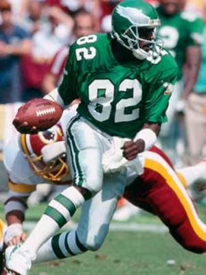
The Redskins have a generally traditional uniform, with their only "outside the box" detail being the Maroon over Maroon combination. With the Eagles wearing White jerseys this week, the Redskins are wearing their rarely seen Maroon over White combination, according to the Redskins official Twitter account. They also have an "all maroon, all the time" combination, as well as a new-as-of-2010 Maroon jersey, Yellow pants look, but . (note: the Redskins officially call the color "Burgundy," but more often than not, it looks Maroon, so that settles it. AND look at the RGB triples on Wikipedia which show that Burgundy is Maroon with some blue added. I'm not seeing any blue in their color. In more color semantics, they call the yellow "Gold," but it looks like plain yellow to my eyes.)
Prior to this season (with their snazzy new yellow pants), the Redskins had been a "White at Home" team, so like the Cowboys with their Blue jerseys, the Redskins' Maroon jerseys over White pants were a rare sight. Apparently, the Yellow pants look to be a "home games only" option, though this is the first week in 2010 where they're wearing Maroon and are the visitors.
Thinking the Eagles were wearing Green over White this week, I originally wrote, "[the Redskins'] new Maroon over Yellow combination is pretty spectacular, so in terms of the Eagles chances this week, let's all be glad they won't be wearing those.", so let's hope Andy Reid knows what he's doing…
The UniDiction
Either 2, 3, 6, or 7 points awarded for each category (safety, field goal, touchdown, touchdown+point after, of course)
Helmet
Eagles: 7 — Same as always. Definitely one of the best helmet designs in the league.
Redskins: 6 — It's a nice color combination, but regardless of the political correctness of the logo, it's sloppy that the man pictured is wearing feathers, and the logo itself is "wearing" feathers. This helmet seen with throwbacks every now and then is much better, combining symbols without both redundancy and caricature. And for retro for the sake of retro, also seen on throwbacks, this rather ugly design also ends up "cleaner" than the official helmet.
Jersey
Eagles: 3 — The White jerseys are unfortunately nondescript compared to the Midnight Green. I've said it before, so I'll say it again, the White jersey just doesn't say "Eagles" the way that the Green one does.
Redskins: 7 — Now then, speaking of jerseys that are intertwined with the team's identity. They have a unique color scheme (quick: name another team who uses maroon as the main color. Answer: the Cavaliers.), the colors complement each other, and while they lack a graphic (like the Eagles heads on the shoulders of the all of the Eagles jerseys), they don't look like they're missing anything.
Pants + Socks
Eagles: 3 — I didn't like them last week, and I won't like them this week. The green pants aren't my favorite. The Midnight Green tends to look generically "dark" on the lower half of the body, not an immediately noticeable color. The two-tone socks also work better with the white pants than the green pants.
Redskins: 6 — The pant stripes are just the right thickness, and the maroon/white socks bring the whole thing together nicely. It's always nice to see a uniform without black in it.
Intangibles
Eagles: 6 — While I don't like the White over Green combination, I'm going to give Andy Reid credit for rocking the boat, and thinking outside of the "this is what we normally do" box.
Redskins: 3 — Even though the Maroon over White look is just about as rare as the Cowboys' Blue over Silver, it doesn't have the same mystique (whether positive or negative) of a well-known but rarely seen uniform. It's a good look, but knowing that the Maroon over Yellow is out there, these can't compare.
Final Score
Eagles 19
Redskins 21
Special Note: Make sure you don't miss the ridiculous pink accessories seen throughout the league today for breast cancer awareness.
The game gets three-and-a-half stars out of five. The Redskins Maroon over White combination is rare enough that it’s notable on its own, and neither team’s uniform is patently offensive.
OK. Let me first apologize for all of you saw my successful week 1 Unidiction and took the week 2 numbers to Vegas. I told you my system only went to 28 — and was based on nothing other than uniforms. If anything would be the sign that you have a problem, betting based solely on uniforms is definitely it.
Speaking of problems… Andy Reid totally destroyed my witty intro to this week’s column. I even had an epic, dog-based pun.
On to the uniforms… according to Uniwatch (as well as my keen eye for research), the Jaguars generally eschew the tradition of “warm weather” teams wearing white at home during September/October, and go right for the teal jerseys. So, the Eagles are in White over Midnight Green for the second week in a row.
As you’ll see below, I’m no fan of the current Jaguars uniforms, but a big, big fan of their previous (pre-2009) look. Specifically, the alternate combination of Teal Jersey over Black Pants was one of the best looks seen in the NFL. Unexpected color combination (teal and gold), no superfluous details, a unique, but reasonable typeface for the numbers…you name it, it had everything. The full story of the unveiling of the current uniform can be found at the Uni Watch Blog, but what’s notable is that the new uniforms are meant to establish a firmer brand identity than the (admittedly bordering on excessive) numerous previous options. Of course, when a team doesn’t have an “identity of winning” (and the fanbase which grows around that winning…unless you’re the Tampa Bay Rays), deciding that the uniforms are the reason for the “identity” issues is much easier than developing a team which is successful on the field.
A quick note about all those combinations: I’m generally pretty tolerant of the “monochrome” football look (Redskins, Seahawks, Texans, etc…by the way, this is a great page about the Seahawks uniforms), but I will admit I take issue with the black/black combination because black is in practically every team’s color scheme to some degree, so it shouldn’t/can’t be the only color worn on a given Sunday (sort of serving as the opposite of a unique identifier). I’d like to think I have a pretty keen eye for this stuff, but I even almost linked to a picture of a Ravens player wearing black over black until I saw that his helmet did not have a jaguar on it.
The UniDiction
Either 2, 3, 6, or 7 points awarded for each category (safety, field goal, touchdown, touchdown+point after, of course)
Helmet
Eagles: 7 — Same as always. Definitely one of the best helmet designs in the league.
Jaguars: 1 — The concept of the logo works, but did you ever notice that the spots on the jaguar are actually kind of life-like, and not just plain dots? Did anyone ever notice? Nope. The detail is too small. There’s something to be said for designing something so people who care see the “little things,” but, that’s taking the expression too literally. If someone from the Jaguars PR department were reading this, he or she would recommend I mention the fact that there’s flip paint on the helmet, showing green in some light and black in other light, but looking through game pictures online, it always looks black (in fairness, the bright spot in the main picture above looks greenish) . Maybe I’ll update this after watching the game in HD on Sunday. The odd black+white stroke along the torso of the players is an odd framing device. I guess it’s to add shape to the players…. because, obviously, football players are like obscure professional wrestlers from the early 90’s who had muscles drawn their clothing…
Jersey
Eagles: 6 — Again, same as last week. This jersey doesn’t say “Eagles” the same way that the green jerseys do, but they have all the details right.
Jaguars: 2 — It’s like they took the old color and turned down the saturation slider. Of all the questionable changes, why modify the shade of teal? It looks like “Honolulu Blue,” another lost between two other shades.
Pants + Socks
Eagles: 3 — I like them less this week, I’m not sure why. For some reason, I’m thinking the white over white would be a better look.
Jaguars: 2 — I am no fan of those weird, partial swoops/stripes on the side of the pants. It’s not that they’re ugly, it’s that they make the pants look unfinished. Another broken detail compared to their previous uniforms. Like the Eagles, the socks are a simple black over white; no harm, no foul.
Intangibles
Eagles: 3 — Like I mentioned in the Pants section above, the White over Green combination didn’t do much for me last week. Maybe it was just due to the way the colors contrasted with the Lions’ uniforms… I’m not sure.
Jaguars: 1 — They took somethinggood and broke it. End of story. The current White over Black is an improvement, but they’re not wearing them this week.
Final Score
Eagles 19
Jaguars 6
In terms of trivia, here’s a look at the original design for the Jaguars uniforms in the 90s which did not survive a lawsuit from Jaguar, the car company. (and, unique as the jersey was, was kind of ugly)
It’s the Eagles’ weaker uniform combination vs. a just plain old sad uniform; this won’t be a good week for Eagles aesthetics.
A lot of stories coming out of last week’s season opener against the Packers. Injuries, a quarterback conundrum (don’t call it a controversy!), and what turned out to be a pretty good uniform match-up. The 1960 throwbacks, which I publicly gave a “meh” opinion, actually worked quite well on the field. And oh yeah…my first UniDiction: Packers 26, Eagles 18. Actual score: Packers 27, Eagles 20. I’m going to count this as a win for my “system.”
There are no “uniform stories” this week (do brain injuries count as “uniform stories” because a helmet is involved? hmm…no. no they do not), so let’s get right to the for the full breakdown after the jump.
The UniDiction
Either 2, 3, 6, or 7 points awarded for each category (safety, field goal, touchdown, touchdown+point after, of course)
Helmet
Eagles: 7 — Metallic Midnight Green, Nicely detailed wings with the silver pattern, black then white double-stroke really makes the design pop. The helmet is definitely the strongest visual identifier for the Eagles.
Lions: 2 — The Lions’ logo is, and has always been “blah,” even though the 2009 refresh specifically tried to address this. Unfortunately, I’m not a fan of the Lions’ color scheme, so nicely proportioned stripes aside, the Silver+Blue+Black+White aren’t making up for the dullness of the logo.
Jersey
Eagles: 6 — Finally some stripes after last week’s throwbacks! The green jersey is the one in the Eagles fan’s mind’s eye, but there’s nothing wrong with the white one. Check out this picture of Kevin Kolb from last week’s game. Based on the fans, it would appear that the Black, Midnight Green, and Kelly Green jerseys are much more popular than the White jerseys.
Lions: 2 — Supposedly the blue is officially called “Honolulu Blue.” It can be bought as a real-deal paint color, so I guess it’s a real color. (example: Kelly Green is a real color, Midnight Green was created by marketers). But Honolulu Blue. It’s like the Color Train was between the baby blue and Yale stations, so decided to choose neither.
Pants + Socks
Eagles: 6 — The stripes on the pants, at first glance, appear to be Black/White/Black, but there’s a neat detail hiding there. The “back” stripe is actually dark grey, not black. The solid black and white sanitaries and socks…plain, but they work without turning the whole combination into stripezilla.
Eagles: 6 — Compared to the normal Green over White combination, these are just lacking…something. BUT, the Eagles do have one of the best looks in the league, effectively mixing the traditional and the modern without looking like an over-financed high school team.
Lions: 3 — I can’t ever fault a team for trying to honor tradition [within reason] (and generally succeeding – as Paul Lukas said last year, they still look like the Lions), but if ever a uniform is exactly the sum of its parts, it’s the Lions in “Honolulu Blue” over Silver. Actually, their White over Silver isn’t so bad. And…at least they’re not wearing the amateurish Black over Silver from the pre-2009 uniform set.
Final Score
Eagles 25
Lions 13
This week’s match-up gets two stars; the Lions uniform is nothing special, and the game will likely be just as (non-) special, and the Eagles will be wearing their “B” uniform.
Being that all predictions for the NFL season thus far are based on a combination of last year’s results and four pre-season games (The NFL Pre-Season — The four weeks when your friends with season tickets slightly regret their purchase!), we might as well base our predictions on something more arbitrary with little bearing on the actual game*. Uniforms.
[*I think some coach or player was once quoted as saying “look good, play good,” so creative interpretation of the rules of English grammar aside, I’ll leave it at “little bearing” instead of “no bearing.”]
The big news for this game is that the Eagles will be wearing their 1960 throwbacks. As detailed at great length previously, I don’t like them. Classic, accurate, but too plain. The presence of Kelly Green should appease the loud “bring back the Cunningham-era jersey” people who don’t realize that the throwbacks are not the same as the “Cunningham-era” uniforms (white vs. silver paints, Eagle logo on shoulder, stroke around the numbers, helmet wing details, etc.). So at the minimum, it takes away their ability to complain about the uniforms, giving more time to complain about things that matter. Like Kevin Kolb.
With the Eagles wearing green jerseys, this puts the Packers in their White Jersey/Yellow Pants combination. I don’t think it’s the best combination in the NFL (undecided on that one at the moment), but it’s everything the Eagles throwback is….except it’s not boring. Something as simple as shoulder striping really makes the look of the “classic” NFL uniform template work well (think of the Bears and the Browns).
The UniDiction
Either 2, 3, 6, or 7 points awarded for each category (safety, field goal, touchdown, touchdown+point after, of course)
Helmet
Eagles: 3 — a white (or black) stroke around the wings would really help. Really, the design looks unfinished. A plain green helmet, though historically inaccurate, would look better.
Packers: 7 — there’s absolutely nothing I would change
Jersey
Eagles: 2 — Championship aside, this isn’t one of the Eagles’ better looks. It’s just green with white numbers!
Packers: 6 — missed PAT because their Green jersey + yellow pants combination is one of the defining images of the NFL.
Pants + Socks
Eagles: 6 — the two green stripes on the white pants definitely add something, and the white stripe on the green section of the socks avoids the “endless field of green” effect seen on the jerseys. That said, one thick vertical stripe would look better on the pants.
Packers: 7 — the contrast-color/white/contrast-color triple stripe on the pants is nice touch, and the two-tone socks (without anything breaking-up the solid color) work because they would look too busy with a stripe, being that there are plenty of stripes elsewhere.
Intangibles
Eagles: 7 — authenticity counts and the fan base really likes them.
It’s that time of year – the notable roster additions and subtractions have been discussed, the expected win-loss record has been decided, the newly featured players have had a chance to step up, and the Cowboys fans have been thoroughly bashed. What’s left? Well, three interminable pre-season “games,” and lengthy discussions of uniforms.
We’ll be taking a hard look at the Eagles 2010 uniform situation today, then running a week-by-week season preview showcasing each expected match-up. (the NFL doesn’t have hard and fast “home” and “away” uniform designations like baseball, so there will be some guessing)
The biggest uniform news this season by far is the addition of the 1960 Kelly Green over White Throwback to be worn for 2 (or 3?) games. Though most fans (this one included) have generally positive opinions of the current “Midnight Green” uniform sets, others clamor for a return to the Kelly Green, which had been the primary color used from 1948 (or prior?) to 1995. “They should wear the Cunningham-era jerseys again” was the typical comment, and I think that most people lump all of the Kelly Green designs together (they look almost the same from the beginning to the last ones in 1995), and, well, the Cunningham “era” is the most convenient point of reference for the “old school” look, if only because the Eagles weren’t a particularly great team during his 1987-1994 run, and the McNabb era is associated with the Midnight Green, though it predates him by three seasons.
Of course, the “reason” (beyond additional merchandise revenue — yes, people even bought the yellow and blue monstrosities from 2007) for the throwbacks is to celebrate the 1960 season, so much of the discussion of “this other Kelly Green design would have been better” is rather moot, but words and opinions are free on the Internet, so here comes the soapbox. Keep in mind this is not a discussion of the authenticity of the throwbacks or how close they got to the classic look; this is all about the look itself.
Simply, the 1960 throwbacks are boring. Not because they’re “old,” not because they’re “classically simple,” but because they’re brutally plain. Look at what the Packers and 49ers can do with the “classic” NFL template. I don’t need the modern busy-ness of the Bengals, the Bills, or the Broncos, but the jersey is literally just green with white front/back numbers and TV numbers (what numbers on the sleeves are called). No stripes, no trim, no stroke around the numbers, heck no logo (the Reebok logo doesn’t count) or even Eagles wordmark. Sure, they’re authentic, but they’re boring, too. [I don’t think the current uniforms are perfect either; see my comments in future articles.] Come to think of it, the vaunted “Cunningham-era” jerseys aren’t all that great either; very, very plain, but at least they added an Eagles logo to the sleeves and black stroke around the numbers (on both the green and white jerseys) adds something to it.
The pants and socks are an improvement, with two green strips along the outseam of the white pants, a white belt, then a ~50/50 ratio of white sanitaries over green socks, with a slim white band on the green socks to visually “break” the verdant field. (triple word score!).
Unfortunately, in the interest of authenticity, the wing detail on the helmet is plain silver. It lacks both the simple white stroke of the “Cunningham-era” helmets and the more complicated black and white inner and outer stroke of today’s helmets (which also include an arguably excessive silver highlight color to give more definition to the “feathers”).
Ignoring the significance of the 50th anniversary, what were some other, maybe more visually interesting options?
Look for future articles about uniforms as the season approaches, then a weekly uniform-centric overview of each upcoming game. Until then, enjoy the Eagles in their white over white combo, a look which is unique to their pre-season games.
The 1960 Eagles Throwback gets two-and-a-half indecisive stars. It’s nice to see the Kelly Green on the field, but it’s definitely not the best version, even if executed exactly.
I wonder if the “Man of Science/Man of Faith” argument could be extrapolated to refer to the skeptics vs. those who had faith in the writers.
“Lost” (pun intended) in the hubbub of last night’s “polar”-izing finale, buried beneath the mystical corks, and cliffhanger fights; airplane escapes and journeys into the afterlife together, is a metaphor that I have yet to see in any of today’s recaps, though I have purposely waited to read Jeff “Doc” Jensen’s EW column for fear of it being the only one to taint my idea with his. Most of the disagreement over whether it was a satisfactory conclusion stands between the two camps of fans: people who wanted more “answers” to mysteries of the island (Jacob’s Cabin, The Hurley Bird, Walt and Aaron being ‘Special’, or even why there’s a giant cork in the island to begin with), and the ones who were more interested in where characters’ stories ended. There are those people (NY Times and NY Post, I’m looking at you) who didn’t understand things that were plainly spoken (“What happened was REAL”), but I tend to throw them out, because they obviously haven’t put enough thought into it.
In case there’s confusion, a brief recap of the important points. The entire season we’ve been given what the show’s writers endearingly call the “flash-sideways”. Instead of mixing in the main narrative with flashes of what has happened (flashback), or what will happen in the future (flash-forward) like they’ve done throughout the series (though the term “future” is relative, and makes my brain hurt), they’ve shown us the same characters we’ve known, in a time that we’ve already seen, now in a world whose relationship to the island universe is unknown. Now, the characters are different though, taking us back to the mindsets and issues they were dealing with in the first season, before all of the crazy island adventures changed, and in most cases, killed them. The characters, while having the same hearts and basic characteristics as the ones we’ve come to know, are altered a little bit, but dealing, in essence, with the same baggage as they did in the real world. Much of the enjoyment of this sixth and final season, just as in the first, lies in discovering who these people are in this world and realizing just how much different they are than the characters we grew to know. The only complication of this narrative device is that since we, the viewer, are incapable of coming to an understanding that both of these universes can simultaneously exist, we have to find a way in our own minds to reconcile the two together. “Which one isn’t real?”, or “Which one will become real?” we ask, because we can’t imagine how both of them can exist and still have meaning. My guess early in the season was that each one of them carried the same amount of weight and that the finale would create duel endings (not reconciling these universes), one happy, and one where everyone died. This would leave the viewer to have to decide for himself which one was real or if both were. I was wrong.
The way they were reconciled was by having each character in this “sideways” universe realize that it wasn’t real; that everyone there had died and that it was a holding place for them to move on to “what comes after death”. Everything on the island had happened. Some people died in the course of the show’s run; some lived full lives After Jack Shepherd (A.J.S.). But there they all were, waiting to move on as one group, changing Jack’s “Live together or die alone” mantra to one of “Live together AND DIE TOGETHER”. Their hurdle to enlightenment and realization of where they were in this universe was letting go of petty issues, guilt, fear, atonement, and instead, embracing the love of others. The Island, and the time spent on it were the most important parts of these people’s lives, and all that came before it was just a prelude and backstory. The relationships forged lasted beyond the characters lifetimes and stayed in the collective unconscious until they were ready to “let go”. Once this was understood, they could all go together towards that slightly cheesy white light, to whatever lay beyond. It was a mostly beautiful, and, at the time, slightly sappy ending, that I ate up wholly, reuniting characters but not compromising by bringing them back to life. Dead is Dead. And it seems as though they successfully put to bed the themes of death and love that hearken all the way back to when the first character, Boone, bit the dust as John Locke’s sacrifice to the hatch.
Before the finale, someone at my place remarked about how more than eighty percent of the characters ever introduced on the show have been killed off, and after last night’s episode, I realized that these deaths weren’t merely part of ratings boosting, or shock value, or plot progression, but they were there to bring about discussion on the theme of death. Anyone can go at any time. That’s a phrase I’ve heard the writers say they’ve wanted to impart on our minds for the entire run of the show. They were going to go so far as to potentially kill Jack in the first episode, originally. If you think about it, there’s probably a whole section that I could write about how the smoke monster/man in black was the antagonist because he couldn’t come to terms with his own anger at his death. Sure he wanted to move on (get off the island), but he couldn’t let go of the pain of the past, and parental issues and learn to accept his life for what it was and love. Jacob, as well, stayed around the island, in spirit form, until he was able to let go of his island protector-ship spurned by his guilt over his brother’s death. Michael was trapped as a spirit on the island forever because he couldn’t get past his misdeeds. But this is all discussion for some other time.
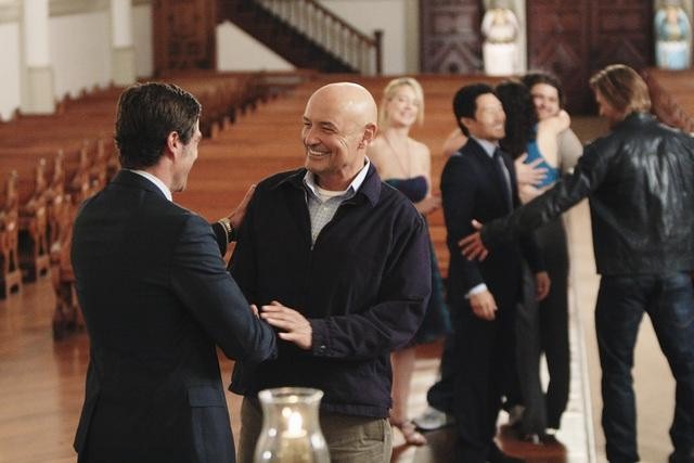
What I’m interested in here is the idea of how the show deals with the topic of death, as it relates to the actual death of the show itself. Wow! THAT IS META! Let me clarify that sentence: In the episode, characters are struggling to deal with the idea that their lives are actually over, and they must move on to the next phase together by letting go and embracing a community of love. Hell, the first scene is a coffin coming out of an airplane and the last is a wake/funeral; if that’s not metaphor material, nothing is. In fact, I’d venture to say double metaphor: death of the characters themselves (aside from the specific Christian Shepherd, as the surface example) AND death of the show. Imagine, if you will, that instead of Christian, inside of this casket is a show that has grown with us over the past six years, one that has become our friend, safe haven, source of philosophical debate and stability in a constantly changing world. Imagine that the fan community for the show, one that brings people together in discussion and love, and one that fills living rooms with ten people or more (or less) per week to share in this joint experience is the crowd of characters in pews embracing each other, joyful, weeping, and filled with human emotions. Last night’s episode wasn’t just about characters accepting death and letting the minutiae go, it was about us as fans of the show learning to do the same. But with this show, unlike most, we had to go together. We had to let go of all the unresolved plot points from four years ago and accept that it had ended. And fill the world with love for it and each other. And last night, and this morning, the internet pretty much exploded, with people who loved it, who will remember the good times and cherish it forever in the “what comes after”, and with those who felt burned, angry about the small things, and may never be able to find peace in the resolution. They’ll be haters, but they’ll be stuck in their “waiting room”, ready to be enlightened when they let their cynicism go.
The more I think about it, the more I realize they been trying to prepare us for this the entire season. Obviously, they knew the show was going to die. The entire flash sideways as a denouement not only works in the context of the characters dying, but for the show itself. While the characters were all set up with different life scenarios and what-ifs, many of them better versions of themselves dealing with the same problems, so was the ENTIRE PREMISE of the show itself. “What would happen if Hurley became a successful businessman, or Sayid could protect Nadia, or Sawyer could actually put away criminals instead of being one?” becomes “What if this horrific plane crash never happened?” What would a self-actualized, but slightly askew version of the first season flashback storytelling look like? How would it mirror (oh snap!) the beloved first season that served as the birth of these characters? In the exact same way as the characters went through this season’s sideways stories, not knowing what their place was, we ventured along the same way, only to be enlightened at the end, and able to see these stories for what they were: a waiting room, there to bring us back together with our deceased friends and help us move on to the place after as a group, a “fandom” if that doesn’t sound too nerdy. Bless you LOST, for the friendships you’ve helped create and strengthen over the past six years will surely be enough to carry us over to whatever comes next. I’ve let go.
I think this metaphor pretty much works, but I’m sure there are a few holes you can punch here and there, and I didn’t mean to come off as preachy in more than an “it’s okay to move on” way.
As for the finale itself…
Learning to let go of the minor things, the mysteries, and go back to my first season mindset, where all I cared about were the characters, this was a total success for me. Sure there weren’t “answers”, but that’s life. I’m dealing. The foam rocks falling seemed a little cheesy though, for the -.5 star. Seeya in another life, Brotha.
What happens when Metallica and Journey get put in a blender, with a little Madonna for consistency? “Rock Sugar” happens.
You come across a lot of Mash-Ups on the internet. It seems like the cool, gimmicky musical viral video thing to do these days, and a lot of it is because the formula is so simple: take a well known song, find another seemingly unrelated song that has a section or line in it with a similar chord progression and tempo (For instance, “Torn” by Natalie Imbruglia and “Where’s the Love” by The Black Eyed Peas would be the first to come to my mind, as they’re so similar and should render the Black Eyed Peas guilty of plagiarism) and put them together. Usually the musical hybrid is just done with samples from pre-recorded songs by the original artists, but what I found this past week completely tore apart that notion and blew me away. Rock Sugar is a completely tongue-in-cheek but wholly talented 80s Hair-Metal/Pop mash-up cover band. You heard (read?) me correctly; they’re a band that plays 80s pop songs to the tunes of some of the most famous classic rock/hair metal bands ever. And they’re amazing at it. This is heavy!!
From their brilliantly funny website biography, their history is as follows:
1989 should have been the best year ever for Rock Sugar, the big haired heavy metal band that had just broken the top 41 on the rock radio charts with their solid brass debut album “Bang You Like A Drum”. But instead of headlining concerts, Rock Sugar made the headlines when they were presumed lost forever after playing an extremely ill-advised gig celebrating the bat mitzvah of 13-year-old Lisa Rosenberg.
The show was performed miles out to sea aboard the private luxury yacht of Lisa’s father, schnapps millionaire Schlomo Rosenberg….
…Shortly after the chorus of Rock Sugar’s second song “Nail You Like A Hammer”, a drunken and violent brawl broke out involving the band, the rabbi, a clown, the captain, a guy in an Smurf costume, Schlomo and well over a hundred infuriated and now thoroughly sexually confused children. In the midst of the fight, as Jesse, the lead singer, was pummeling the Smurf and no one was steering the damned ship anymore, it struck an undersea stone wall. As the boat was sinking, the extremely unhappy and now yachtless Schlomo refused to let Rock Sugar climb aboard the life rafts to safety.
Having been denied rescue, the band credit their miraculous ability to make it to the shore alive only because of their firmly held belief that “Sharks don’t eat metal”. Left to their own extremely questionable survival skills, Rock Sugar managed to salvage several items from the sunken yacht. In addition to their instruments, they retrieved a hot pink battery powered boom box covered with stickers of Hello Kitty, a crate of batteries, 158 cases of schnapps and numerous articles of teenage girls’ clothing, most of which the band admit to trying on and several pieces of which apparently fit and looked “pretty frickin’ awesome”. But things got worse when the horrified rockers discovered that the only music available for them to listen to was little Lisa Rosenberg’s very pop, very 13 year-old girl’s, very ‘80’s CD collection.
And so, the hardcore degenerate heavy metal members of Rock Sugar spent the last two decades stuck on an island with nothing to do but drink schnapps, catch hard to digest wildlife, befriend monkeys and dream of their long LOST groupies while listening only to, and being slowly and systematically brainwashed by, every favorite pop song of a 1980’s preteen girl. Bored, full of schnapps and wasting away on a tropical oasis, they built a stage out of driftwood, bamboo shoots and tree sap and got to work. Against the odds, Rock Sugar was alive… and they were practicing.
But does a hilariously fictional backstory make for a good album? I think your level of interest in each song comes down to the following criteria. 1) How well does the band play each song? 2) Do you know/enjoy the songs they used? 3) How surprised are you when the songs come up? and 4) How well do the songs mesh together? We can tackle these questions individually.
1.) How well does the band play each song?
The musicians themselves are brilliant. Essentially, they’re a cover band with mostly great arrangements (see question 4), but they slip in and out of subgenres and vocal styles, flawlessly mimic and reinvent these classics, and can flat out play. Lead singer Jess Harnell (who, in the most bizarre part, is the voice actor behind Wakko Warner of the “Animaniacs”, and uses his chameleonic voice talent to mimic the vocal styles of a multitude of lead singers) is simply amazing. The band breaks out the “Journey” songs twice, and he manages to hold his own against (if not outdo) Steve Perry, one of the five greatest lead singers of all time.
In fact, the album’s second last track, “Round and Separated” (a mix of “Round and Round” by Ratt and “Separate Ways” by Journey) is an epic joy, almost entirely because of how talented the band is. The energy and technical proficiency here are high enough to elevate these two decent but not exceptional songs into something better than the sum of the two parts, into a cohesive whole that just might be better than either song ever was. Production level is solid. Every instrument can be heard cleanly, and the background vocal work is fantastic throughout.
2.) Do you know/enjoy the songs they used?
A large portion of enjoyment comes from whether you know these songs, but this knowledge isn’t completely necessary. “Voices in the Jungle” is a prime example. I’ve never heard “Voices Carry” and am only slightly familiar with “Welcome to the Jungle“. The song works though, because the source material is strong and appeals to me. Conversely, “We Will Kickstart Your Rhapsody” didn’t work for me, solely because I don’t think “Kickstart My Heart” is that great of a song. Other people I know have different opinions though. I just don’t particularly like that style, I guess. But they can play it well, and sing the Bohemian Rhapsody harmonies. For the most part though, I enjoyed all the other songs. If you only know the pop (or relatively pop-py) songs, it works as an album of hard rock covers. You may miss the other musical references, but you won’t have any idea what you’re missing. Hard rock purists should find these songs funny at first, and then come to the realization that they aren’t bad, it was just the way that they were packaged that was. (much like Britney Spears’ “Hit Me Baby One More Time“) On the whole, the songs are extremely enjoyable and catchy, whether you knew them previously or not.
3. How surprised were you when the songs came up?
I suppose if you checked the track list before listening to each song, you’d be able to guess at least one of the songs used in each track, but I think a great amount of the album’s enjoyment comes from being thrown completely out of your element. You’re going along, listening to the opening chords of a song you’ve heard a thousand times, played nearly exactly how you’ve heard it all those times, and all of a sudden, something completely unexpected, but highly recognizable pops up. You can’t believe your ears! Why haven’t you ever thought of that?! These guys are geniuses, you think. These songs were made to be played together! Part of this goes to question four, though. If the songs don’t go well together, then this surprise aspect is just a gimmick, and a failed one. But when you’re surprised and shocked, I think this is the biggest impetus to share this band with your friends; to see the looks on their faces when “Don’t Stop Believing” comes in, instead of the “Enter Sandman” verse. The best example of this is the epic finale “Mashterpiece”, “Dreaming of a Whole Lotta Breakfast”. Again, you can probably guess what goes into it, judging by the title, but there are a lot of surprises in it, and they all fit perfectly. Whereas “Round and Separated” mostly works because of the band’s talent and charisma, this songs works because of the amazing arrangement and the element of surprise. Have a listen.
4. How well do the songs mesh together?
This is the most hit-or-miss question. “I Love Sugar on Me” works because very little had to be changed in each song for them to fit against each other. But when the first verse of “Workin’ for the Weekend” kicks in in “Prayin for a Sweet Weekend”, it sounds awkward. The playing of the “Sweet Child of Mine” riff under the “Weekend” chorus works well though. “Heaven and Heaven” works great, even if it’s more of a medley than a mash-up. “Here Comes the Fool You Wanted” is great, even if the “Nobody’s Fool” contribution is only a line from the chorus sung over and over (on top of two other vocal parts) at the end. I feel like the chords on the verses of “Shook Me Like a Prayer” aren’t the same as “Shook Me All Night Long”, but instead, just power chords, played AC/DC-style, that would normally fit under the Madonna verse. The same can be said about “Straight to Rock City”. Not to say that these tracks aren’t great, they just needed some re-arranging to “fit together”. The chorus part on “Straight to Rock City” while a brilliant melding of “Straight Up”, and “Detroit Rock City”, is a little strange, but it’s something I can’t put my finger on. Maybe something with accented syllables versus up/downbeats, but I have no idea. So in all, there are a bunch of songs where they took parts that work well, (a chorus section or something, where the two parts fit together) and built the rest of the song with the music from one element, and the style of another. This seems to be more of a style mash-up than a direct musical mash-up. Again, not that any of this is bad, but if you’re looking for straight mash-up goodness, some of these songs might not be what you’re looking for.
Most of these songs are epically awesome. A few of them though either don’t work (“Prayin for A Sweet Weekend”), feel like filler (“Breakin’ The Love”), or just didn’t appeal to me (“We Will Kickstart Your Rhapsody”). Everything else is fantastic though. The musicianship is great, the songs are entertaining, and come with an already built-in knowledge that doesn’t require people to listen to them over and over to learn the words and music. “Here Comes the Fool You Wanted” and “Dreaming of a Whole Lotta Breakfeast” are triumphs of arranging, and the sheer power of “Heaven and Heaven” and especially, ESPECIALLY “Round and Separated”, elevate this to an album that I will keep in my music circulation for a long time. I can only imagine how great they’d be in concert. Also, props go to the pristine production quality of the album itself. Everything is audible and clean. And the concept itself is completely brilliant. They take the idea of being a cover band and elevate it to something wholly different, adding a level of creativity, and injecting new life into songs that have been stale from overplay on classic rock stations for a long time. Truly this is a rock-tastic piece of confection.
Alec and Steve were the only friends left at “Oscar’s” birthday party after mom kicked Kratos out after “the incident.”
Some quick thoughts opinions:
The “interpretive” dancing to accompany the Best Music (Original Score) nominees was tacky and plain-old ridiculous. Being that the music was written for a movie, why not show either a) a montage/custom trailer showcasing the music against the images or b) show a specific scene from the movie as-is which highlights the connection between composer and the visual material. The eventual winner, UP, has a sequence which would have lent itself perfectly for, you know, showing the effect of the music instead of a bunch of people spinning on their heads or doing the robot. If they want to show break-ish dancing, America’s Best Dance Crew does it better (and without the false pretense of it being “fine art.”)
Aside from the fact that a movie which would be more properly described as “rendered” (or raytraced, or something or another) rather than “filmed,” won for Best Cinematography, why did they show no clips, again, showcasing the recognized, excellent cinematography? I believe only the title cards were shown. Sure, most of the movies (except, Harry Potter, I believe) were shown in other awards’ intro sections, but movies are a visual medium, show it if it’s awards-worthy! Or maybe you could get the interpretive dancers to movieoke the scenes in question.
The Best Actor/Actress “wedding toasts” are still awkward and unnecessarily long. BUT, watching the obligatory “Oscar-bait” scenes are usually just as cringe-worthy. Of course, this year we got to see what happens when a “who’s that guy?” actor without a compelling story (acting debut and [celebrated for some odd reason] morbid obesity, for example) gets nominated…Colin Farrell is left to relate stories from their time off set during the filming of SWAT because there is no body of work to reference (yet?). Consider it a tie between the old “bait” and new “toasts” methods. [Jeremy Renner absolutely deserved to be nominated and would not have been a surprise winner, and unrelatedly, SWAT wasn’t all that bad of a movie, either].
In terms of Best Picture and Best Director (considering them interrelated here)… eh, The Hurt Locker was good, but felt a bit incomplete. Imagine a collection of seven interrelated short stories, any of which could be swapped for the climax of the movie. Unique, yes, but District 9 took another unique presentation method and did it better. The Hurt Locker would be somewhere below Up in the Air, District 9, An Education, and even Avatar on my list.
P.S. The Blind Side is an awful, awful movie. Meryl Streep did “I get what I want,” bad-ass chick better in The Devil Wears Prada, though Sandra Bullock was definitely the best part of the movie (which is notable because there was anything in it that could be considered “best”).