Category: Sports

  • UniDiction: Week 11 – Eagles vs. Giants

    Main

    Because my system is as arbitrary as possible, I’ll gladly point out that even though I predicted (um, UniDicted?) a score of Redskins 23 – Eagles 15, but the actual score was a completely different (but pretty awesome) Eagles 59 – Redskins 28, I can retroactively make it so any score above 28 (the  system only goes to 28) is wrapped around to zero.  Of course, the Eagles got to 28 twice, so that’s two wrap-arounds.  Modified final score: Redskins 28 – Eagles 3.  See, I said the Maroon over Yellow combination was great.  Of course, I fully accept responsibility of my 7-3 record, and using a retroactive rule to pad the stats doesn’t really count.

    On to this week’s Giants vs. Eagles game.  This is actually a pretty straight-forward uniform match-up.  The Eagles are in the Midnight Green over White, and the Giants have a very rigid uniform system, which puts them in White over Grey on the road and Blue over Grey at home.  (there are some tricky pants details which I’ll get into below, but all-in-all, there won’t be any surprises this week.)

    The UniDiction

    Either 2, 3, 6, or 7 points awarded for each category (safety, field goal, touchdown, touchdown+point after)

    Helmet

    Eagles: 7 — This continues to be one of the best helmets in the league.  “Functional” details are the best.  Let’s face it, simply putting the team’s logo on the side of a helmet is boring.

    Giants: 3 — Blue and Red always go together, but really, “NY” alone is boring.  This isn’t unheard of with New York teams, but even the 80s-90s Giants helmet had something going on on it.  Sure, they have a heritage of plain helmets, but old does not equal good. 

    Jersey

    Eagles: 7 — When fans think of the “post-Cunningham” Eagles, they’re picturing the Midnight Green jerseys.  A unique, bold color, detailed strokes and drop shadows on the numbers, and nice use of logos on the sleeves and collar.

    Giants: 2 — A few issues with their White jersey.  And each one of these issues is Red.  The jersey is plain, but it works.  The Northwestern strips on the sleeves add just enough detail to keep them from looking like a White t-shirt with numbers on the front and back.  Sure, Red is one of their official colors, but it simply doesn’t look….correct.  Here’s a picture which has been digitally altered by the Uniwatch people to replace the Red with Blue.  Ahh, that’s better.

    Pants + Socks

    Eagles: 6 — The White pants provide nice contrast with the solid green of the jersey, and instead of plain white, the thick Black ad Green stripes (with the pencil thin grey stripe) on the side of the pants gives them a slightly modern touch.  Black over White socks also break up the White from the pants 

    Giants: 6 — Interestingly, both pants the Giants wear are Grey with a combination of Blue and Red stripes.  Their home pants get thick stripes of Blue-Red-Blue which are flush to each other and the away pants get thinner stripes of Red-Blue-Red with the Grey base material peeking through.  Socks are Blue at home and the incongruous Red on the road.  So, we’ll see the thin Red-Blue-Red stripes and Red socks tonight.  Both pants designs are, at worst, harmless, with my preference being the thicker, connected stripes of the home pants.  Those Red socks make me think of the Red details on the White jersey.  They should be Blue.

    Intangibles

    Eagles: 6 — This is the Eagles second game in their signature uniform combination, and let’s face it, it looks good.

    Giants: 3 — The fact that the Giants’ nickname is “Big Blue” means that Red should be a highlight color (think of how Blue is one of colors of the Phillies, and aside from the great-looking alternate hat, it’s always hiding as either the dot on an “i,” on the button on the crown of the standard hat, or as the stroke on the alternate uniforms).

    Final Score

    Eagles 26

    Giants 14

    Random, relevant uniform trivia:

    The Giants wore a Red alternate jersey from 2004-2008, and they combined it with both the away pants and the home pants.  I actually liked the look, but historical or not, “Big Blue” should not be wearing solid Red.  Here’s a lengthier rant on the state of the Giants (by a Giants fan…).  For the record, the whole “It doesn’t make sense for Big Blue to be wearing red” thing is not something I cribbed from Uniwatch/Paul Lukas, but I’ll point out that his analysis is much more complete than mine.

    **** Sure, the Giants uniform is plain, but it’ll be a pretty good looking game, actually.

  • UniDiction: Week 10 – Eagles vs. Redskins

    Main_edited

    Real Score: Eagles 26 – Colts 24.  UniDiction Score: Eagles 26- Colts 23.  Come on, you can admit it.  I’m onto something here.

    This week is an interesting one; it’s the first “second game” of the NFC East intra-division match-ups, and the Eagles opted to wear White over Green for their home game, so tonight’s game in Washington D.C. (well, Maryland, to be exact),  is going to almost be a repeat of the Week 4 match-up.

    The Redskins don’t post their uniform plans the way the Eagles do, so working backwards from the fact that the Eagles are in White over Green, this puts the Redskins in Maroon jerseys over… probably Yellow pants.  They make break out their White pants (like they did for the first game against the Eagles), but they’re home this time, and it’s a prime time game, so I think it’s safe to assume they’ll be in their “prime time” uniform combination.  (Dear sports jingo enthusiasts….it’s on.)

    Of course, they haven’t been 100% consistent with the “Maroon over Yellow at home,” either, as they broke out the Maroon over White for their home game against the Packers, so if there’s an “emergency edit” of this article around 8:25 tonight… I wouldn’t know anything about that.

    [the following is much of what I posted for their first game with some tweaks here and there…]

    The Redskins have a generally traditional uniform, with their only “outside the box” detail being the Maroon over Maroon combination.  They also have an “all white, all the time” combination which hasn’t shown up this year, as well as a new-as-of-2010 Maroon jersey, Yellow pants look.  (note: the Redskins officially call the color “Burgundy,” but more often than not, it looks Maroon, so that settles it.  AND look at the RGB triples on Wikipedia which show that Burgundy is Maroon with some blue added.  I’m not seeing any blue in their color.  In more color semantics, they call the yellow “Gold,” but it looks like plain yellow to my eyes.)

    Prior to this season (with their snazzy new yellow pants), the Redskins had been a “White at Home” team, so like the Cowboys with their Blue jerseys, the Redskins’ Maroon jerseys over White pants had been a rare sight.  Ten weeks into the 2010 football season, and the White jersey never appearing for home games, I think it’s safe to say that the 2010 Redskins are not a “white at home” team.  (of special note for the previous link: that page was just updated last week to include the first half of the 2010 season).

    Unidiction below, but I’ll warn you, the Maroon over Yellow is pretty spectacular.

    The UniDiction

    Either 2, 3, 6, or 7 points awarded for each category (safety, field goal, touchdown, touchdown+point after, of course)

    Helmet

    Eagles: 7 — Same as always.  Definitely one of the best helmet designs in the league.  I’m a sucker for “functionalhelmet designs.

    Redskins: 3 — It’s a nice color combination, but regardless of the political correctness of the logo, it’s sloppy that the man pictured is wearing feathers, and the logo itself is “wearing” feathers.  It’s like snacks on snacks, not wholly unnecessary, but overkill.  This helmet seen with throwbacks every now and then is much better, combining symbols with neither  redundancy nor caricature.  And for retro for the sake of retro, these throwbacks use this rather ugly design which also ends up looking “cleaner” than the official helmet.

    Jersey

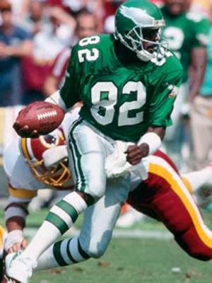
    Eagles: 3 — The White jerseys are unfortunately nondescript compared to the Midnight Green.  I’ve said it before, so I’ll say it again, the White jersey just doesn’t say “Eagles” the way that the Green one does.  Sure, it’s grown on me a bit this season, but it’s not the one.

     Redskins: 7 — Now then, speaking of jerseys that are intertwined with the team’s identity.  They have a unique color scheme (quick: name another team who uses maroon as the main color.  Answer: the Cavaliers.), the colors complement each other, and while they lack a graphic to add some flavor to the design (like the Eagles heads on the shoulders of the all of the Eagles jerseys), they still look like a complete NFL jersey.

    Pants + Socks

    Eagles: 3 — The green pants are still a dubious decision at best.  The Midnight Green tends to look generically “dark” on the lower half of the body, not an immediately noticeable color.  The two-tone socks also work better with the white pants than the green pants.

    Redskins: 7 —  It takes real (foot)balls to get away with wearing mustard yellow pants  Luckily the maroon matches.  The picky out there (me, included) will notice that the striping pattern on the Yellow pants does not match the striping pattern on the White and Maroon pants.  White and Maroon get simple double-stripes of the non-pant color from the 3 color options, but the Yellow pants get what I’ll call a “sandwich stripe” with White being the meat and Maroon being the bread.  (We take our figurative language very seriously here at Crossing Broad.  The same goes for our sandwiches.)  Speaking of stripe inconsistency, the Maroon socks worn with the Yellow pants include stripes; the Maroon socks worn with both the White and Maroon pants do not include any stripes.  But, inconsistency aside, they look good.

     Intangibles

    Eagles: 2 — Sure, as the away team, the Eagles aren’t completely in the driver’s seat in terms of the uniform they have to wear, but really Eagles fans, White over White is a better look if we’re forced to wear the White jerseys.  Points are awarded this week because the banishment of the pink breast cancer “awareness” gear has greatly improved the gridiron aesthetics all month.

    Redskins: 6 — What else can I say?  Maroon over Yellow is a great look.  In fact, it’s so good, that I’m going to dock one point for failing to consistently use it as their only home uniform.

    Final Score

    Eagles 15

    Redskins 23

    Random uniform trivia: The Vikings wore Purple pants with White jerseys yesterday (which followed them wearing Purple over Purple the week before).  Those games are the first time the rarely seen purple pants have been worn since 2007 (according to Wikipedia… which cites a dead link on the Vikings official page.  Ladies and gentleman, I present to you, Wikipedia!).

    Also, speaking of uniforms, Kyle Kendrick had an English Bulldog dressed as a cocktail waiter (or ring bearer?) at his wedding over the weekend.  Awesome.

    *** The Eagles bring it down, but the Redskins take it up.

  • UniDiction: Week 9 – Eagles vs. Colts (Throwbacks!)

    Slide1

    Ok.  So, 6-2 doesn’t have the same ring as 7-1, but with a system this arbitrary, that’s still pretty good, right?  Right?

    Two really big uniform stories this week.  1) The Eagles will actually be wearing their “official” home uniform today for the first time this season. 2) The Colts will be wearing their 1955 throwbacks which are making their first regular season appearance.

    And, oh yeah, it’s no longer October, so the ridiculous pink breast cancer “awareness” gear will be gone- the NFL profits off the sale of that gear, yo.

    UniDiction after the jump.

    The UniDiction

    Either 2, 3, 6, or 7 points awarded for each category (safety, field goal, touchdown, touchdown+point after)

    Helmet

    Eagles: 7 — This continues to be one of the best helmets in the league.

    Colts: 7 — The solid Navy Blue is a good, rich color, but I’m divided about moving the horseshoes to the back of the helmet.  They’re difficult to see in practice, BUT I think they’re supposed to be the “this is what you see after the horse/colt runs you over.”  I’ve awarded the Eagles points for their “functional” aspect of the helmet wings, so I’ll give points for the “just ran you over” footprints on the Colts helmets.  We value attention to detail here at Crossing Broad.

    Jersey

    Eagles: 7 — Finally, half-way through the season, the Eagles will be wearing their “proper” home uniform set.  Midnight Green jerseys over White pants.  When fans think of the “post-Cunningham” Eagles, they’re picturing the Midnight Green jerseys.  A unique, bold color, detailed strokes and drop shadows on the numbers, and nice use of logos on the sleeves and collar.

    Colts: 3 — See, here’s the thing with a team like the Colts wearing throwbacks.  Their normal uniforms are pretty much throwbacks.  Nothing against their classic normal uniforms, of course, but these throwbacks are pretty much identical except for having triple stripes on the shoulders/sleeves instead of double stripes. “Classic” doesn’t necessarily mean “best,” though, and their White jersey, whether the new throwback or their normal throwbacks-in-anything-but-name jerseys, are very unremarkable with their gigantic field of white with sparse use of color.  Thankfully the Colts have a “history of winning,” so no one gets up in arms about their harmless uniforms.

    Pants + Socks

    Eagles: 6 — The White pants provide nice contrast with the solid green of the jersey, and instead of plain white, the thick Black ad Green stripes (with the pencil thin grey stripe) on the side of the pants gives them a slightly modern touch.  Black over White socks also break up the White from the pants 

    Colts: 6 — See above about the “throwbackness” of the jerseys.  Today’s pants replace the double stripe with a single super-wide stripe, and solid blue socks over white sanitaries are replaced with white socks with triple blue stripes.  I like them.  The thick blue stripes get rid of the plainness of the white pants, and the triple striped socks connect the bottom half of the uniform with the top half.

    Intangibles

    Eagles: 6 — The Eagles will finally be wearing their “real” home uniforms today.

    Colts: 7 — It’s a strong move for a team whose current uniform is pretty much a throwback to wear a special throwback which is more-or-less identical except for the helmet.  NOTE: I was tempted to add an additional 7 points to “Intangibles” based on “Peyton Manning will be wearing this uniform today,” but I figured that would be philosophically unsound with respect to the purpose of this column.  You’re welcome, professional journalists.

     Final Score

    Eagles 26

    Colts 23

    Random, relevant uniform trivia:

    The Colts wore blue pants for a few games in 1995.  That weird feeling you’re getting when looking at these pictures is called cognitive dissonance.  The Colts shouldn’t be wearing blue pants…. even if it’s actually a pretty good look.

    ****½ All in all, a pretty good looking game.

  • 2010 Eagles UniDictions – Week 4 – Redskins

    Sorry I was a little slow getting this posted, and it ends up being more of a past tense prediction, but here it is was. As always, this was cross-posted on crossingbroad.com. Look for the Week 5 Unidiction on Sunday.

    Redskins_red_over_white_3 
    This has been a bad week for the uniform department of Crossingbroad.com.  First, the Eagles show up in White over White last week, and we've just found out from some of our more astute readers (and Eagles Gameday) that they'll be wearing White over Green at home.  And I thought they were only having a QB controversy!  Updated Post is below.  Thanks for the heads-up, readers.

    Wow.  Speaking of us being wrong.  I march in with a confident, "Eagles will be wearing White over Green," and what happens?  They break out the normally-preseason-only White over White.  Of course, I will shamelessly point out that I also mentioned that the White over White would be a much better option than White over Green, so maybe Andy Reid isn't all that out of touch… maybe.  Oh yeah, in terms of outright wins and losses, my Unidictions are 3-0, and updating for last week's surprise appearance of the aesthetically more appealing White over White, I'm seeing increased scores in the Pants/Socks and Intangibles category, so we're looking at +3 for intangibles and +3 for pants.  The (retrospective) Unidiction: Eagles 25, Jaguars 6.  Actual score: 28-3.  That's pretty darn close.

    On to the hotly anticipated Redskins vs. Eagles match-up.

    The Redskins have a generally traditional uniform, with their only "outside the box" detail being the Maroon over Maroon combination.  With the Eagles wearing White jerseys this week, the Redskins are wearing their rarely seen Maroon over White combination, according to the Redskins official Twitter account.  They also have an "all maroon, all the time" combination, as well as a new-as-of-2010 Maroon jersey, Yellow pants look, but .  (note: the Redskins officially call the color "Burgundy," but more often than not, it looks Maroon, so that settles it.  AND look at the RGB triples on Wikipedia which show that Burgundy is Maroon with some blue added.  I'm not seeing any blue in their color.  In more color semantics, they call the yellow "Gold," but it looks like plain yellow to my eyes.)

    Prior to this season (with their snazzy new yellow pants), the Redskins had been a "White at Home" team, so like the Cowboys with their Blue jerseys, the Redskins' Maroon jerseys over White pants were a rare sight.  Apparently, the Yellow pants look to be a "home games only" option, though this is the first week in 2010 where they're wearing Maroon and are the visitors.

    Thinking the Eagles were wearing Green over White this week, I originally wrote, "[the Redskins'] new Maroon over Yellow combination is pretty spectacular, so in terms of the Eagles chances this week, let's all be glad they won't be wearing those.", so let's hope Andy Reid knows what he's doing…

    The UniDiction

    Either 2, 3, 6, or 7 points awarded for each category (safety, field goal, touchdown, touchdown+point after, of course)

    Helmet

    Eagles: 7 — Same as always.  Definitely one of the best helmet designs in the league.

    Redskins: 6 — It's a nice color combination, but regardless of the political correctness of the logo, it's sloppy that the man pictured is wearing feathers, and the logo itself is "wearing" feathers.  This helmet seen with throwbacks every now and then is much better, combining symbols without both redundancy and caricature.  And for retro for the sake of retro, also seen on throwbacks, this rather ugly design also ends up "cleaner" than the official helmet.

    Jersey

    Eagles: 3 — The White jerseys are unfortunately nondescript compared to the Midnight Green.  I've said it before, so I'll say it again, the White jersey just doesn't say "Eagles" the way that the Green one does.

     Redskins: 7 — Now then, speaking of jerseys that are intertwined with the team's identity.  They have a unique color scheme (quick: name another team who uses maroon as the main color.  Answer: the Cavaliers.), the colors complement each other, and while they lack a graphic (like the Eagles heads on the shoulders of the all of the Eagles jerseys), they don't look like they're missing anything.

    Pants + Socks

    Eagles: 3 — I didn't like them last week, and I won't like them this week.  The green pants aren't my favorite.  The Midnight Green tends to look generically "dark" on the lower half of the body, not an immediately noticeable color.  The two-tone socks also work better with the white pants than the green pants.

    Redskins: 6 — The pant stripes are just the right thickness, and the maroon/white socks bring the whole thing together nicely.  It's always nice to see a uniform without black in it.

    Intangibles

    Eagles: 6 — While I don't like the White over Green combination, I'm going to give Andy Reid credit for rocking the boat, and thinking outside of the "this is what we normally do" box.

    Redskins: 3 — Even though the Maroon over White look is just about as rare as the Cowboys' Blue over Silver, it doesn't have the same mystique (whether positive or negative) of a well-known but rarely seen uniform.  It's a good look, but knowing that the Maroon over Yellow is out there, these can't compare.

    Final Score

    Eagles 19

    Redskins 21

    Special Note: Make sure you don't miss the ridiculous pink accessories seen throughout the league today for breast cancer awareness.

    ***½

    The game gets three-and-a-half stars out of five. The Redskins Maroon over White combination is rare enough that it’s notable on its own, and neither team’s uniform is patently offensive.

  • 2010 Eagles UniDictions (uniform + predictions) – Week 1 – Packers

    This has been cross-posted on crossingbroad.com, a great destination for Philadelphia sports news.

    Mainweek1

    Being that all predictions for the NFL season thus far are based on a combination of  last year’s results and four pre-season games (The NFL Pre-Season — The four weeks when your friends with season tickets slightly regret their purchase!), we might as well base our predictions on something more arbitrary with little bearing on the actual game*.  Uniforms. 

    [*I think some coach or player was once quoted as saying “look good, play good,” so creative interpretation of the rules of English grammar aside, I’ll leave it at “little bearing” instead of “no bearing.”] 

     The big news for this game is that the Eagles will be wearing their 1960 throwbacks.  As detailed at great length previously, I don’t like them.  Classic, accurate, but too plain.  The presence of Kelly Green should appease the loud “bring back the Cunningham-era jersey” people who don’t realize that the throwbacks are not the same as the “Cunningham-era” uniforms (white vs. silver paints, Eagle logo on shoulder, stroke around the numbers, helmet wing details, etc.).  So at the minimum, it takes away their ability to complain about the uniforms, giving more time to complain about things that matter.  Like Kevin Kolb.

    With the Eagles wearing green jerseys, this puts the Packers in their White Jersey/Yellow Pants combination.  I don’t think it’s the best combination in the NFL (undecided on that one at the moment), but it’s everything the Eagles throwback is….except it’s not boring.  Something as simple as shoulder striping really makes the look of the “classic” NFL uniform template work well (think of the Bears and the Browns).

    The UniDiction

    Either 2, 3, 6, or 7 points awarded for each category (safety, field goal, touchdown, touchdown+point after, of course)

    Helmet

    Eagles: 3 — a white (or black) stroke around the wings would really help.  Really, the design looks unfinished.  A plain green helmet, though historically inaccurate, would look better.

    Packers: 7 — there’s absolutely nothing I would change

    Jersey

    Eagles: 2 — Championship aside, this isn’t one of the Eagles’ better looks.  It’s just green with white numbers!

    Packers: 6 — missed PAT because their Green jersey + yellow pants combination is one of the defining images of the NFL.

    Pants + Socks

    Eagles: 6 — the two green stripes on the white pants definitely add something, and the white stripe on the green section of the socks avoids the “endless field of green” effect seen on the jerseys.  That said, one thick vertical stripe would look better on the pants.

    Packers: 7 — the contrast-color/white/contrast-color triple stripe on the pants is nice touch, and the two-tone socks (without anything breaking-up the solid color) work because they would look too busy with a stripe, being that there are plenty of stripes elsewhere.

     Intangibles

    Eagles: 7 — authenticity counts and the fan base really likes them.

    Packers: 6 — Points awarded for using yellow in their color scheme.  Missed PAT due to the management thinking a uniform from an era with completely different equipment would translate to the 21st century.

    Final Score

    Eagles 18

    Packers 26

    Hmm… I may need to adjust my scoring system to add up to numbers which look like real “football scores.”  And so it can go above 28… 

    Also of interest, UniWatch (Paul Lukas) on Page 2 posted his 2010 overview of all NFL uniform changes yesterday.  Definitely a must read.

    ****

    The match-up itself gets four stars. Both teams will be wearing “classic” uniforms, and both teams’ colors complement each other.

  • Eagles 2010 Uniform Round-Up – The 1960 Throwback

    This has been cross-posted on Crossing Broad, an up-and-coming Philadelphia Sports destination — heck, they’re the ones who broke the story that Dorney Park was the first rehab assignment for Ryan Howard

    Lil’ Shebaz: Patriot, Martyr, Wide Receiver.

    It’s that time of year – the notable roster additions and subtractions have been discussed, the expected win-loss record has been decided, the newly featured players have had a chance to step up, and the Cowboys fans have been thoroughly bashed.  What’s left?  Well, three interminable pre-season “games,” and lengthy discussions of uniforms.

    We’ll be taking a hard look at the Eagles 2010 uniform situation today, then running a week-by-week season preview showcasing each expected match-up.  (the NFL doesn’t have hard and fast “home” and “away” uniform designations like baseball, so there will be some guessing)

    The biggest uniform news this season by far is the addition of the 1960 Kelly Green over White Throwback to be worn for 2 (or 3?) games.  Though most fans (this one included) have generally positive opinions of the current “Midnight Green” uniform sets, others clamor for a return to the Kelly Green, which had been the primary color used from 1948 (or prior?) to 1995.  “They should wear the Cunningham-era jerseys again” was the typical comment, and I think that most people lump all of the Kelly Green designs together (they look almost the same from the beginning to the last ones in 1995), and, well, the Cunningham “era” is the most convenient point of reference for the “old school” look, if only because the Eagles weren’t a particularly great team during his 1987-1994 run, and the McNabb era is associated with the Midnight Green, though it predates him by three seasons.

    Of course, the “reason” (beyond additional merchandise revenue — yes, people even bought the yellow and blue monstrosities from 2007) for the throwbacks is to celebrate the 1960 season, so much of the discussion of “this other Kelly Green design would have been better” is rather moot, but words and opinions are free on the Internet, so here comes the soapbox.  Keep in mind this is not a discussion of the authenticity of the throwbacks or how close they got to the classic look; this is all about the look itself.

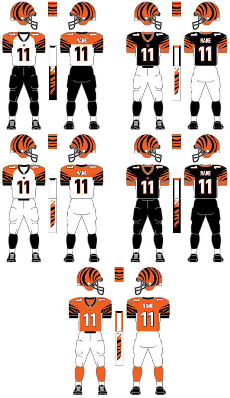
    Simply, the 1960 throwbacks are boring.  Not because they’re “old,” not because they’re “classically simple,” but because they’re brutally plain.  Look at what the Packers and 49ers can do with the “classic” NFL template.  I don’t need the modern busy-ness of the Bengals, the Bills, or the Broncos, but the jersey is literally just green with white front/back numbers and TV numbers (what numbers on the sleeves are called).  No stripes, no trim, no stroke around the numbers, heck no logo (the Reebok logo doesn’t count) or even Eagles wordmark.  Sure, they’re authentic, but they’re boring, too.  [I don’t think the current uniforms are perfect either; see my comments in future articles.]  Come to think of it, the vaunted “Cunningham-era” jerseys aren’t all that great either; very, very plain, but at least they added an Eagles logo to the sleeves and black stroke around the numbers (on both the green and white jerseys) adds something to it.

    The pants and socks are an improvement, with two green strips along the outseam of the white pants, a white belt, then a ~50/50 ratio of white sanitaries over green socks, with a slim white band on the green socks to visually “break” the verdant field.  (triple word score!).

    Unfortunately, in the interest of authenticity, the wing detail on the helmet is plain silver.  It lacks both the simple white stroke of the “Cunningham-era” helmets and the more complicated black and white inner and outer stroke of today’s helmets (which also include an arguably excessive silver highlight color to give more definition to the “feathers”).

    Ignoring the significance of the 50th anniversary, what were some other, maybe more visually interesting options?

    Well, the 2nd most of thought of (in my incredibly unscientific poll of one) Kelly Green uniforms are those funky ones from 1969-1973 with a white helmet with green wings.  (even funkier in 1973 when they had a black stroke around the green wing).  Then there are those “wasn’t disco bad enough” late 70s-early 80s disasters.  Or as I call them Stripezilla 1 and Stripezilla 2, Stripezilla’s Revenge.  Or, they could’ve done something practically sacrilegious and just replaced Midnight Green on the current uniforms with Kelly Green and swapped in the silver pants of the “Cunningham-era” (file by Jeff Shirley from a uniwatchblog.com uniform tweak round-up).

    Look for future articles about uniforms as the season approaches, then a weekly uniform-centric overview of each upcoming game.  Until then, enjoy the Eagles in their white over white combo, a look which is unique to their pre-season games.

    **½

    The 1960 Eagles Throwback gets two-and-a-half indecisive stars. It’s nice to see the Kelly Green on the field, but it’s definitely not the best version, even if executed exactly.

  • The Lost Posts – “Attending the June 3rd 2007 Phillies-Giants Game”

    Going back and finding posts I never finished, I saw that this one was completed, but never posted… maybe I just didn’t have a picture to go with it.

    victorino
    He could probably have jumped over Danny DeVito.

    Allow me to list the numerous things that made this game completely awesome for me to have seen in person.

    1. Shane Victorino Hula Figurine- As part of the larger “Hula Day”, celebrating Shane Victorino, for fans under 14 they were giving out Dashboard Hula Figurinesof the Hawaiian outfielder. We put a baseball hat on my 21-year-old sister, she passed as 14 I guess, because the old guy at the gate totally gave her one. Later, when I commented on the fact that she passed for 14, she punched me in the stomach.

    2. It’s Always Sunny in Philadelphia’s Rob McElhenney and Danny DeVito threw out the first and second pitch, to a hula-skirt-wearing Phanatic. DeVito’s only made it halfway.

    3. Bizarrely terrible plays. Ironically, it was anything but sunny as there was a constant rain, which caused Pat Burrell to throw a ball about 15 feet, and Mike Zagurski to throw a ball directly into the ground. It didn’t, however cause Freddy Garcia to not run out a ground ball to second, with deserved “Boo”s from the crowd.

    4. Five-run comeback, punctuated by Ryan Howard’s three-run home run, with two outs, to give them the lead, which was eventually relinquished when the Giants tied the game.

    5. Watching Danny DeVito Hula Dance during the 7th inning stretch.

    6. Booing Barry. Barry Bonds came up with a chance to give his team the lead. He was greeted by bigger BOOs than Freddy Garcia, and grounded into a double play.

    7. Walk-Off. After letting the Giants tie the game in the 9th, the day’s focus, Shane Victorino becomes the hero with a walk-off home run in the 10th. Though the stands in that video are empty, I don’t think that many people left. It had been raining constantly for about an hour and most people were hiding wherever they could find cover.

    *****

    This game just goes to show why you never leave a baseball game until it’s over, even if it’s raining.

  • The 2008 Phillies Alternate Uniforms

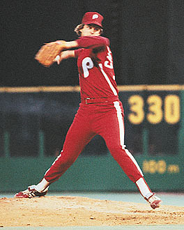
    The Phillies have been one of the few teams to not have alternate uniforms in the last 15 years; the White Sox have their solid black jerseys, the Diamondbacks have their solid red and solid black, and on and on throughout the league. The Phillies have had an alternate hat the last few years, but it’s only worn during the three weeks of interleague games.

    alternates

    For 2008, the Phillies will have a third uniform which will hopefully go over better than their 1979 “Saturday Night Specials” which were worn only once. Basically, the new uniform is the home uniform minus the pin-stripes (and the right arm number) plus a new hat inspired by the 1946 design (the modern “P” is slightly different). Well, in terms of being really picky, the vertical strip on each pant leg is blue-red-blue with the normal home uniforms missing the stripe (would look too busy with the pinstripes) and the current away uniforms having white-red-white stripes on the outside of each pant leg. Notice the blue stroke around all of the copy, the blue-red-blue at the edge of each sleeve and neck as well. These details are reminiscent of the late 90’s Blue Jays uniforms.

    The verdict? I like them – I’ve always been a fan of the ill-fated, solid blue alternate hats worn for about a month in 1994 because the 1993+ uniforms have always been very, very red, with no other colors except the blue stars dotting the “i’s” and the blue button on top of the hat. Blue’s seen in the batting practice jerseys and hats, but they’re definitely not the image of the team. I would prefer the brim to be solid blue to match the rest of the hat instead of being red, but it is an obvious throwback to the hats of the late 40’s. (I think a better choice would be solid blue with the stylized logo of the current alternate hats but with a white “P” and red star to create a disturbingly complete symmetry between the home and alternate hats, but oh well – that combination would probably be a bit much, if not unnecessary.)

    ****

    I guess it comes down to whether these new alternate uniforms are more interesting than the 70’s/80’s maroon design. The Brewers wear their wildly popular 80’s uniforms on Friday night home games, and I’m sure that lots of Phillies fans would like them to do the same, but let’s leave those for turn-back-the-clock games instead of being a normal part of the rotation. The 2008 Phillies Alternate Uniforms get four stars: they’re obviously not a risky choice, and I’m sure lots of people will buy a replica when they’re available, so good work to the design team responsible for not copping out and settling on just a solid red jersey with white pants to match pretty much every other team in the league.

    If you’re at all interested in uniform-related stuff, be sure to check out http://uniwatchblog.com, a daily-updated blog on the topic.

  • Guest Review: Madden 2008 (XBox 360)

    Guest Review! Kyle from notthegame.com weighs in on Madden 2008.

    Madden 2008 is a bit of an enigma. In the last few years, on the new systems, Madden has been a sub par football game. This is typical for sports games on a new system as it takes game developers a few years to revamp the game engine, as well as improve graphics and features. The third year is typically the year when progress starts to be made. Take the PS2 versions, for example, in 2002 and 2003 the game redefined the way football games look but they didn’t play that well, in 2004 the game took on a life of its own, and by year four in 2005, Madden reached its pinnacle. That lines the 360 version up for 2009 as the pinnacle of its success on the new systems.

    Madden 2008, however, is a serious step in the right direction. This year, Madden has perfected the game play, improved already stellar animations, and added the features and options we have come to expect from the Madden franchise. If by next year, EA Sports can improve the presentation, get rid of the god awful radio announcer, and add some innovation to franchise mode, the game will reach a level never before seen.

    That being said, here is a break down of this years game.

    Graphics:

    Madden has never really been known for its graphics and animation, but this year that is starting to change. Animations are now much more natural, as players will reach for balls and drag their feet on the sideline. EA Sports uses what it calls a “branching” system. Essentially, this allows the movements to transfer from one to another seamlessly. In 60 frames per second, the game runs beautifully, but since everything is so smooth, the occasional jump in animation between say, standing and falling, seems very out of place. All in all the graphics are very good, next year EA Sports needs to add some more presentation elements.

    Sound:

    The radio announcer sucks. It sounded like a good idea, but really he is just annoying and makes the game feel outdated (think Joe Montana Sports Talk Football), there is no reason why the biggest selling sports game of all time shouldn’t have real announcers. The hits and the players yelling make the on field experience great, but the crowd is just “ok”.

    Gameplay:

    Extremely fun and fast. The game plays with a ferocity that Madden hasn’t seen in years. The hits, running, and catches are truly fun to accomplish, and the realism is outstanding. It is one of the few games where neither the defense or the offense dominates. Some games are commanded by defense, while others are controlled by electric offensive players.

    The new superstar abilities is well implemented and really gives stars individuality on the field. If you try to tackle Lindell White high, forget about it. For big backs, you need to hit them low utilizing the new Hit-Stick 2.0. It is these little idiosyncrasies that really make the game shine. The gameplay is tight, but it does feel a little tired, as the plays have been the same for years now.

    Features:

    Franchise mode has some added options, most specifically the ability to relocate your team. Superstar mode has playable camera angles, but during the season there is not much to do other than play games, practice, and bitch to your agent. Its fun, but its not a fulfilling experience as you only get to play the plays with your player, so you don’t development an emotional connection to your team.

    Overall:

    Madden plays great, looks good, and sounds horrible. In all, it is a good game, but there are times where I feel like I’m left wanting more. This years game is shaping up to be the penultimate game, with a little tweaking, next years will reign supreme.

    8 K’s out of 10. A Brett Myers.

    KKKKKKKK

    Dan: Uh, 8 “K’s” out of 10? A “Brett Myers?” These aren’t star ratings! How are we supposed to make sense of this? Let me do some math…

    ****

  • Pitchfork Media’s Review of “Shine On” and “Get Born” by Jet

    My review of “Step One” by Steps. Wow, that was easy. I didn’t even have to sit through the CD!

    When you read a review, you expect certain things. You want to hear some insightful positives and negatives regarding the thing being reviewed. You don’t want to be talked down to. You hope to have an overall idea of whether said object is worth seeing/listening to/buying/reading/visiting/eating/doing/throwing things at. And after you’ve done any of those things, you want to come back and read that review again to determine whether you agree or think the reviewer is out of his mind. Basically, you expect reviews like this and this. Then you go to a website whose supposed specialty is reviews, and you see something like this. This “review” only manages to fit one of those criteria, that being the last one” that this reviewer is totally out of his mind.

    A long time ago, when the second Franklin movie was being planned, our discussion took a long detour, with us arguing over the definition of the phrase “cop out”. There were numerous e-mails sent back and forth trying to determine if an idea that I came up with was something that constituted this. You can read highlights here. This argument was never really solved, but I stand here today telling you once and for all, that this “review” is the definition of “cop out”.

    I can gather by the video clip shown here that the “reviewer” doesn’t like Shine On, but I was interested in hearing some actual insight into what makes it good or bad. Granted, the CD wasn’t that great (there were three songs on it that I thought were really good, but the rest was kinda mediocre), but it doesn’t deserve to have its review have nothing interesting or meaningful to say at all. I don’t know how a high-fallutin’ website like pitchforkmedia decided that that was representative of their organization, but recently, they even put up a similar video, claiming it was a JET music video. Obviously, the pretentious music-lovers have a thing against the Aussies rockers, but I really can’t figure out what it is.

    The review of their first album, Get Born, gives us a little more understanding, but I use the word “little” literally. It’s presented in the form of a discussion between the band and the owner of a venue where they’re supposed to be putting on a concert. Things go wrong at the concert and the fans turn on the band. Sure there are opinions presented about the band, but I’m sure they’re all completely over-the-top exaggerations from someone who’s never seen them live or met them. I can’t imagine a band (aside from the Flaming Lips or Ozzy Osbourne) actually demanding [thirty f%$&in’ angry alligators with top hats on, Iggy Pop shooting out of that cannon, and midway through sending in the kid from the iPod commercial.] It may work as a review of the band, but as a review of the album it fails miserably.

    It only mentions three songs from the CD (very briefly) and it only has two points that I gleaned from the whole thing. The first is that all their songs sound like other bands (citing AC/DC, Iggy Pop, Wallflowers, Oasis, Bon Jovi and the Rolling Stones). The second is that they have “insipid love songs that sound like wedding band covers” and “insipid lyrics, we say ‘Come On!’ and ‘Oh Yeah!’ every five seconds”. So basically the guy only knows one insulting adjective. You know, there’s a thesaurus feature in MS word, and I’d assume there’s also one on the trendy Mac you also probably use. Insipid: dull, bland, wishy-washy, characterless, colorless, trite, tame, unexciting, uninteresting, boring. Maybe none of those words sounded smart/insulting to readers enough, though I’m partial to the word “trite

    Here’s the thing that the review is missing. The music is fun. It’s not meant to be high art. It’s not meant to be genre-pushing. It’s meant to be music with easy-to-learn lyrics and melodies that you can put in your car CD player, turn the volume way up on, roll down your windows and shout at the top of your lungs and have a good time. And it completely succeeds at that, something that this reviewer was competent enough to pick up on. There’s a good mix of fast and slow songs (so the whole CD doesn’t sound the same, a huge pet peeve of mine), and I like most of the slower songs. I understand that a lot of the faster songs sound similar, but they’re catchy enough that it doesn’t bother me (a problem that the second CD had), much like with critically lauded Franz Ferdinand. As far as the words go, I’m not expecting poetic lyrics, so why should I complain that they’re not there? Did people who went to see Pirates of the Caribbean complain that there wasn’t a deeper meaning in the dialogue, or that it wasn’t a British period piece about some queen from the 17th century? I would hope not. They should be expecting to have fun. That’s all I expect out of it. That’s not to say that I shouldn’t hold the band accountable for bad music, I just don’t think that criticizing lyrics for this kind of music is really the way to go. Do critics complain about the lyrics to “SHOUT” or “MONY MONY”? Some of the songs on that Fountains of Wayne CD, Welcome Interstate Managers had TERRIBLE lyrics, but critics dismissed them because of how fun the melodies were.

    Now some of you who are familiar with Aaron Copland’s book, “What to Listen for in Music“, would say that I’m only listening to this album on a “sensuous”, or maybe an “expressive” level, and that to fully understand why music is good or bad, I have to be listening to it on a “sheerly musical” level as well, combining the three. Well, in response to that I would claim that there isn’t too much to it on a musical level, but my musical knowledge is limited. I’m learning to increase what I hear when I listen, but I want to understand what makes this a musically good or bad album. That’s why I went to a site where I knew I would find a harsh but intelligent criticism of the CD. But there was none of that there. Instead, all I got was a poorly-written, profanity-laced diatribe against the band for mimicking other bands. Personally, since there really isn’t any truly popular band playing right now that sounds like them, I don’t have too much of a problem with it, but I’m reviewing the review, and not the band or CD, so that doesn’t really matter.


    Zero stars for the cop-out Shine On so-called review.

    ½
    ½ star for the creativity to write a review for Get Born as a dialogue. Minus four and a half for not having any substance to it at all, not talking about the songs, and basically complaining because Jet has songs that sound like bands that lots of people like.